
Always say never! Oh, never mind…
This morning, something dropped in my mail box and I had to look twice, three times even and check my previous emails to see if it really could be true. Did Gmail and Unibox have a serious issue with their font translation? Or is the font of choice for the European Design Awards entry newsletter really Comic Sans – in capitals?!?!!?
In a mild state of shock and disbelief (obviously there are more pressing issues out there than what font an awards organisation chooses to pop in their email header design), but I had to check it out with WhatTheFont and it really seemed to be Comic Sans… Hmmmm.
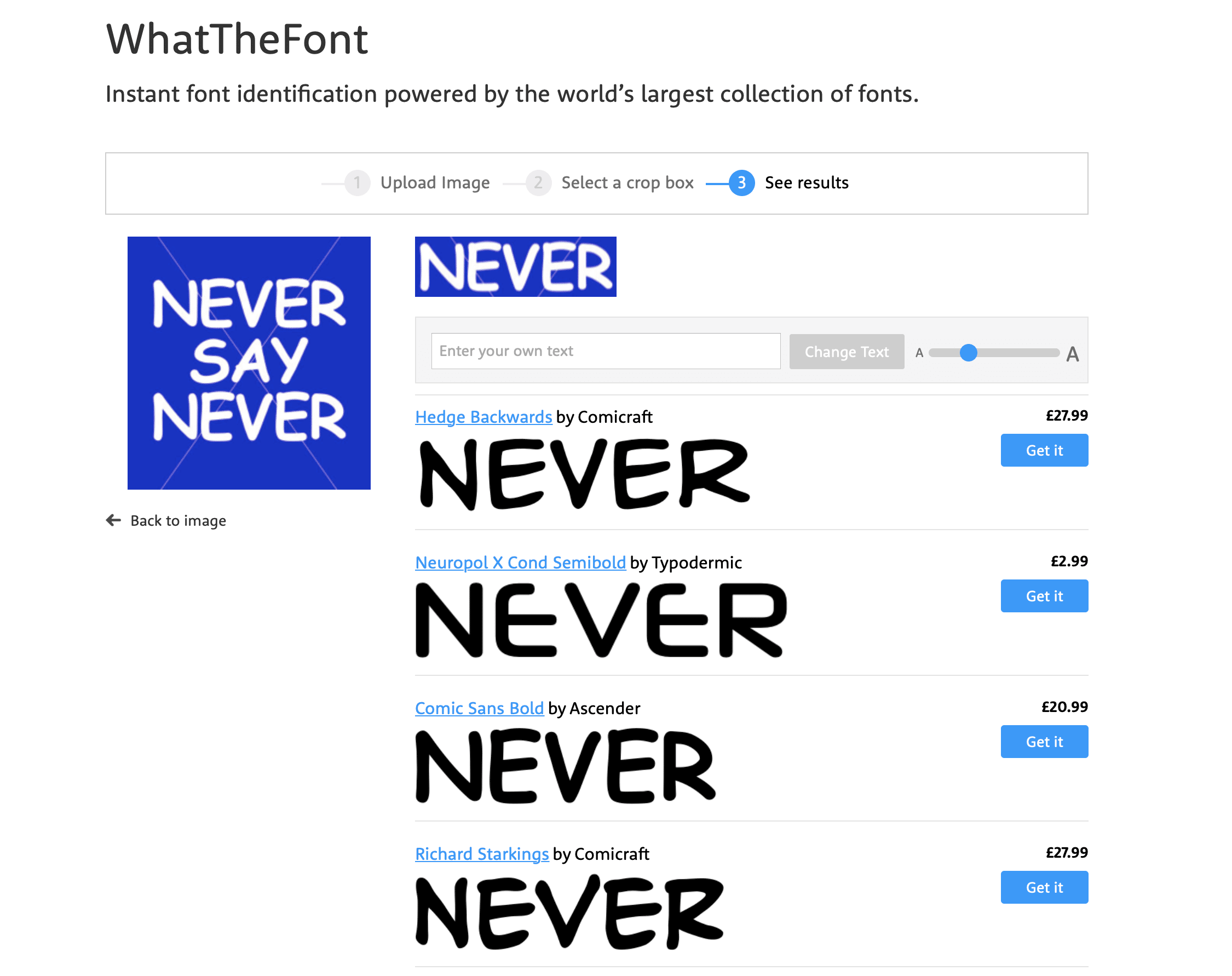
And then it hit me. Never say never! You can laugh now at just how dumb a moment I’ve had this morning. Their little visual hook was just perfect to get me, obviously gullible and opinionated when it comes to branding and design, to keep reading… so well done, mission accomplished!
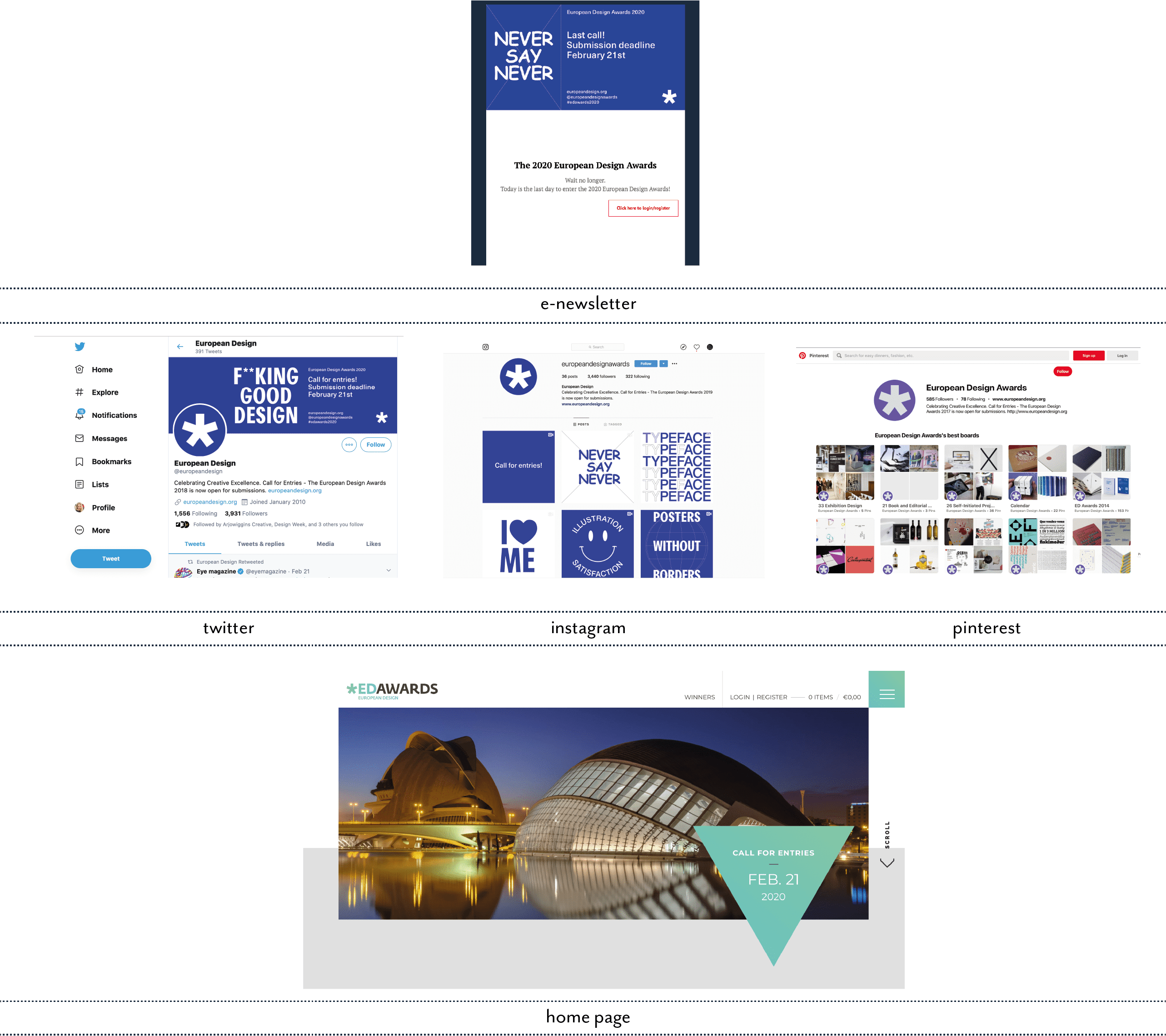
My only criticism, I guess, is the fact that the newsletter and their social media look so different from their actual web home page. I think that’s what threw me. It was only when I saw their Instagram that the penny dropped and I could see the method in the madness.
So, after all this, and hanging my head in shame for doubting their taste or typographic sanity, I can only thank them for highlighting once again how critical good typography is for design, no matter which media.
With the amazing tools available today for web, email and obviously print, typography is sadly still very much an afterthought for SME brands with a ‘that will do’ attitude when looking at their marketing and brand collateral.

Regine Wilber
I am a brand consultant and conceptual designer. I love using creativity to solve problems for our clients. In my spare time, I like jigsaws and probably a bit of a board game geek.

Other Articles


Newsletter
Geeky Bits


