
Serif Typefaces and their lesser-known sub classes
A serif is not a serif, so there are sub categories, pointing to the origin of each class. Serifs can be categorised as Venetian, Old Style (Geralde), Transitional, New Transitional, Modern, Slab Serif and Wedge Serif.
Serif type has its origin in a necessary artefact of stone masonry where Latin words were carved into stone in Roman antiquity. When you work with a chisel, there would inevitably be a starting mark, and the serifs would allow words to appear aligned. The Victorians used serifs in all of their typefaces, and they were common in Italian Renaissance architecture where they were seen as “Roman.”
Serifs remained a distinct feature of certain typefaces long after technology moved type away from stone.
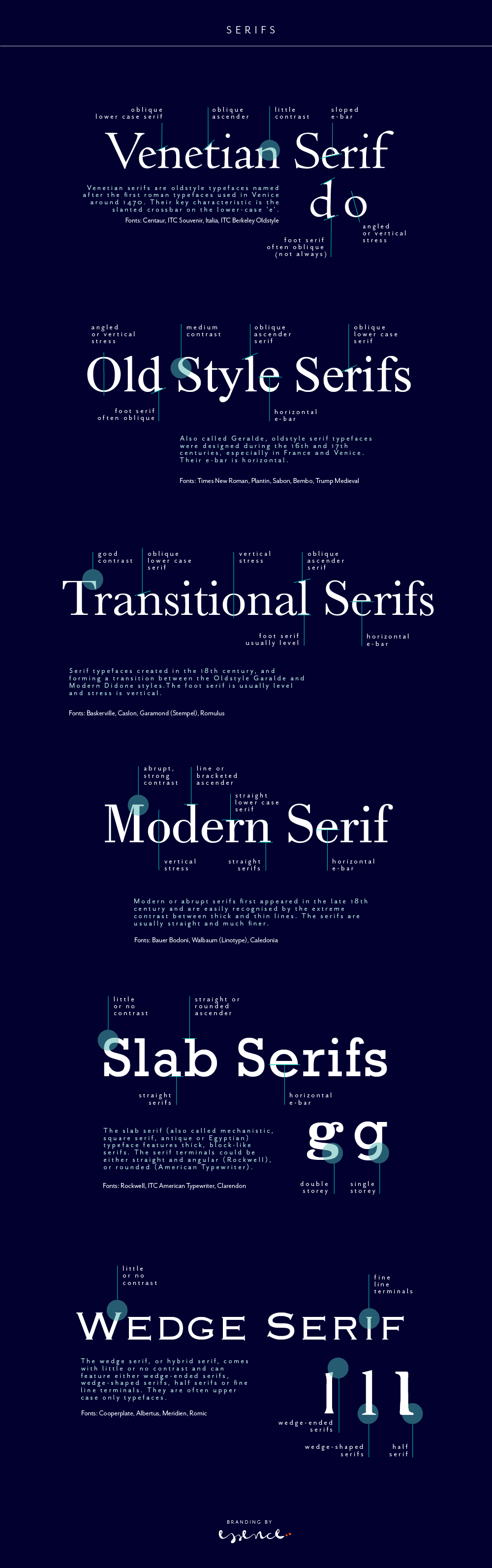
Venetian Serifs
Venetian serifs are oldstyle typefaces named after the first roman typefaces used in Venice around 1470. Their key characteristic is the slanted crossbar on the lower-case ‘e’.
For example: Centaur, ITC Souvenir, Italia, ITC Berkeley Oldstyle
Old Style Serifs
Also called Geralde, oldstyle serif typefaces were designed during the 16th and 17th centuries, especially in France and Venice. Their e-bar is horizontal.
For example: Times New Roman, Plantin, Sabon, Bembo, Trump Medieval
Transitional Serifs
Serif typefaces created in the 18th century, and forming a transition between the Oldstyle Garalde and Modern Didone styles.The foot serif is usually level and stress is vertical.
For example: Baskerville, Caslon, Garamond (Stempel), Romulus
Modern Serifs
Modern or abrupt serifs first appeared in the late 18th century and are easily recognised by the extreme contrast between thick and thin lines. The serifs are usually straight and much finer.
For example: Bauer Bodoni, Walbaum (Linotype), Caledonia
Slab Serifs (Egyptian)
The slab serif (also called mechanistic, square serif, antique or Egyptian) typeface features thick, block-like serifs. The serif terminals could be either straight and angular (Rockwell), or rounded (American Typewriter).
For example: Rockwell, ITC American Typewriter, Clarendon
Wedge Serifs
The wedge serif, or hybrid serif, comes with little or no contrast and can feature either wedge-ended serifs, wedge-shaped serifs, half serifs or fine line terminals. They are often upper case only typefaces.
For example: Cooperplate, Albertus, Meridien, Romic
If you want to read more about type classifications off the beaten track, I can recommend the Typefinder that was written by Sarah Rookledge and Phil Baines (who used to be my tutor at Saint Martins College).

Regine Wilber
I am a brand consultant and conceptual designer. I love using creativity to solve problems for our clients. In my spare time, I like jigsaws and probably a bit of a board game geek.

Other Articles


Newsletter
Geeky Bits


