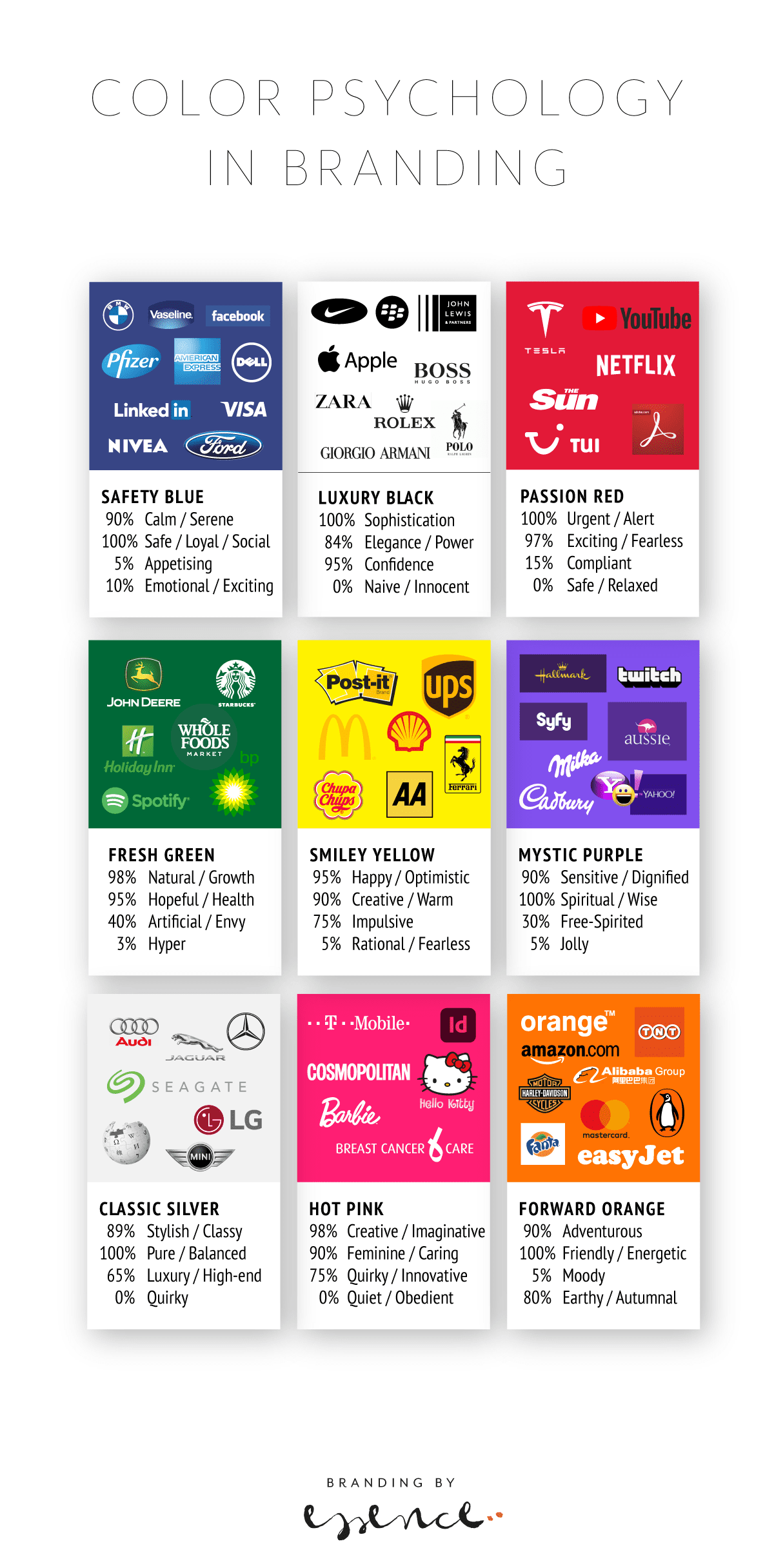
Brand colour swatches and why they matter
Have you ever wondered why so many companies of a certain type use a certain colour in their brand identity? And how it gives you a funny feeling when you see one that just doesn’t kinda fit?
Most of the popular brand colours make sense in one way or another – with blue being the expected ‘safe’ options often chosen by insurance companies, classic technology or financial businesses. Brands that live on trust and reliability.
Black is also suitably predictable. Luxury, confident, powerful – with the downside of sadness and grief. Purple seems to be the chosen colour for chocolate and tech…
Find silver logos and you will definitely find cars! And of course luxury brands with a traditional sense of wealth and exclusivity. Look at well-known green-coloured brands and you will see an eclectic mix from coffee through to oil. This may be because green does not only stand for healthy, wholesome goodness, but also for freshness, growth and innovation.
As with all things, colours and their brand allocation come with subtleties and subjective notions. How you feel about purple may be different to how your dad does – and which shade is chosen can also tip the balance from vibrant to icky or classic to dull. Colours are one of the most powerful tools we have when designing brand identities, yet they are also one of the trickiest one to get right.
It would be interesting to find out what the most common colours are and if that has changed as brands have changed throughout the ages.
Can you use colours to predict which brands will stay and which will disappear from the high street and which will be the new stars?

Read more about colour psychology and brand identity design in Emily’s article.

Regine Wilber
I am a brand consultant and conceptual designer. I love using creativity to solve problems for our clients. In my spare time, I like jigsaws and probably a bit of a board game geek.


