
Tag: Brand Strategy

Graphic design brand materials

Brand colour swatches and why they matter

Have you ever wondered why so many companies of a certain type use a certain colour in their brand identity? And how it gives you a funny feeling when you see one that just doesn’t kinda fit?

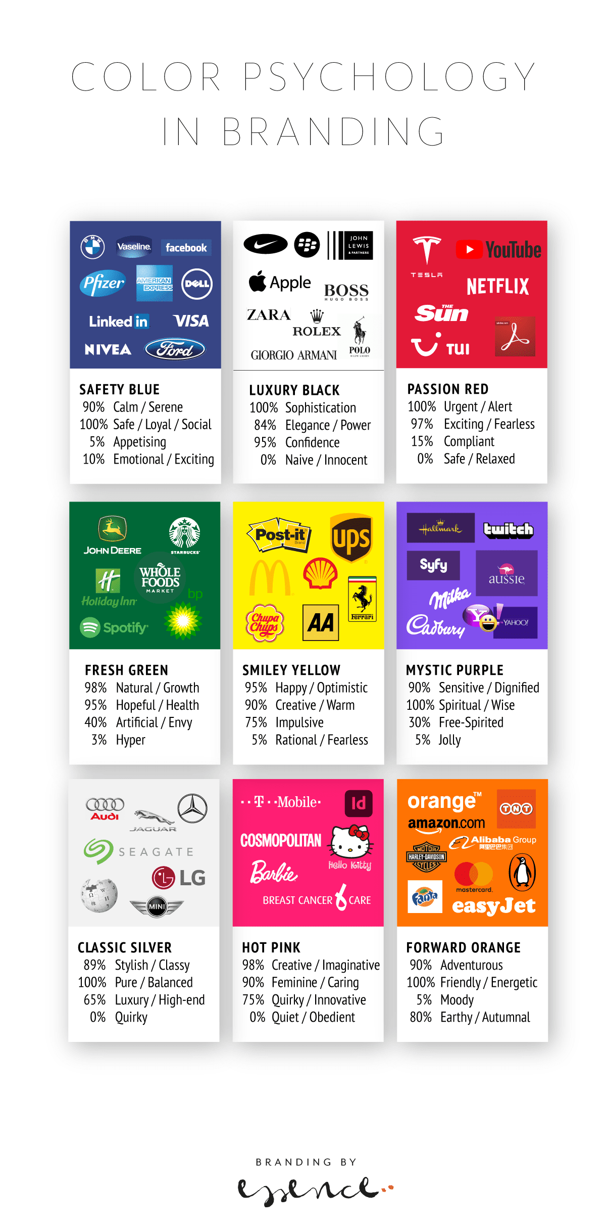
Most of the popular brand colours make sense in one way or another – with blue being the expected ‘safe’ options often chosen by insurance companies, classic technology or financial businesses. Brands that live on trust and reliability.

Black is also suitably predictable. Luxury, confident, powerful – with the downside of sadness and grief. Purple seems to be the chosen colour for chocolate and tech…

Find silver logos and you will definitely find cars! And of course luxury brands with a traditional sense of wealth and exclusivity. Look at well-known green-coloured brands and you will see an eclectic mix from coffee through to oil. This may be because green does not only stand for healthy, wholesome goodness, but also for freshness, growth and innovation.

As with all things, colours and their brand allocation come with subtleties and subjective notions. How you feel about purple may be different to how your dad does – and which shade is chosen can also tip the balance from vibrant to icky or classic to dull. Colours are one of the most powerful tools we have when designing brand identities, yet they are also one of the trickiest one to get right.

It would be interesting to find out what the most common colours are and if that has changed as brands have changed throughout the ages.

Can you use colours to predict which brands will stay and which will disappear from the high street and which will be the new stars?

Read more about colour psychology and brand identity design in Emily’s article.

brand, brand advertising, brand design, Brand Identity, brand identity design, Brand Strategy, Branding

Tech, branding and ducks

I just mentioned a paragraph I have in our brand strategy workbook to my other half, techy Steve, and he taught me yet another new thing. Duck typing! (“Duck typing in computer programming is an application of the duck test—”If it walks like a duck and it quacks like a duck, then it must be a duck”—to determine if an object can be used for a particular purpose. With normal typing, suitability is determined by an object’s type.” Wikipedia)

Our brand strategy workbook talks about why you should bother with a brand strategy: “If it looks like a duck, swims like a duck, and quacks like a duck, then it probably is a duck.” With a good strategy, you make sure your duck isn’t suddenly featuring a shark fin and razor sharp teeth hunting little chicks…

I like it when tech and design share the same sentiments.

Brand Strategy, programming

Kate photography branding

The marvellous Mrs Hollingsworth

This has been one of my favourite projects recently. Creatives are like doctors – the worst patients. I am not sure if I read this somewhere or if it’s an unspoken gospel. For me, I know how hard I find it to promote myself. Not because I don’t believe in it, but because clients always come first and as you all know, it takes a lot of time to get everything look ‘on brand’. So when Kate asked me to help her rebranding again now that she’s been in the photography field for nearly 10 years, I jumped at the task.

It has been a journey, that’s for sure. A windy road of trial and error because Kate cares just as much as all good creatives do about their work and how it’s seen by others. So it was a brave move for her to step out of her comfort zone, show who she truly is and what her passion is in a non-photographic visual sense. We’ve had many sessions going over her brand values again and again to see if they held up in light of her approach, ideal customer, specialism, tone of voice, etc – and how this should be reflected in the brand visuals.

She’s a pro, always has been, as a TV director and then as a photographer, and she’s one of a kind. Which is why this identity is bold and bright and as quirky as Kate is. The print material is designed to emphasise her style and the lovely story telling of her images.

We then created a matching website for her portfolio and blog. It’s designed for mobile and desktop and showcases her wedding, brand and family photography.

It’s been a pleasure working with Kate Hollingsworth and I hope she gets all the recognition she deserves (which is tons and tons and tons!!!) Go Kate, get them married!!!

brand design, Brand Strategy, Design, website design