What is a logo?
A brand is not a logo. A logo is not a brand.
“A logo is the gateway to the brand.”
Milton Glaser
Weirdly, in some ways the brand used to be a logo. Going back to the origins of branding, when farmers would burn their mark onto animals to identify them as part of their herd. (I’ve always felt that spraying colour on their fur is far more fun and less gruesome but I’m no farmer…)
So whilst a brand is not just a logo, a logo is definitely a very important, visual part of a brand. It’s a mark, an icon or symbol that people can easily recognise and that represents a company.
There are several types of logo constructions. Here is some more information about the perhaps most common ones.
Letterform
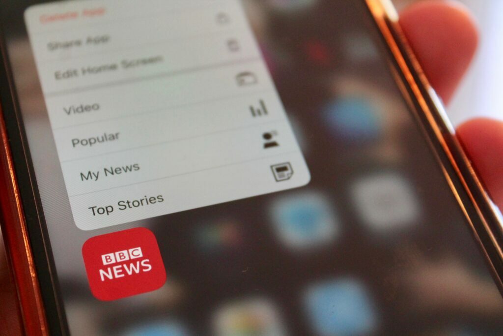
Letterforms are logos that consist of letters. Classic ones are IBM, BBC, H&M, 3M, HP, GA, ING… They are usually acronyms that stand for the long brand name, a bit like a monogram on a handkerchief.
This type is a typography-based logo with just a few letters. Simplicity is key here. The abbreviated company names also have the advantage that they roll off the tongue much better and are easier to remember. Imagine the url for International Business Machines .com (IBM) or Minnesota Mining and Manufacturing Company (3M).
The focus on typography is important for the success of a letterform logo. Legibility and recognisability being two key factors here. You should also consider that the above mentioned samples are from household brands. If yours is not one (yet) of those people will have heard of, this has its own challenges.
Wordmark
Also typography-led, wordmarks or logotypes are a font-based logos which simply consist of a word, i.e. a company or product name. Ebay is a common example, as is Tate Modern, Google, Coca-Cola or Uber. Wordmarks work well with short, catchy names that are unique and memorable. Take that and mix it with strong typography and you are on the way to creating a recognisable brand.
They are also widely used by designers, photographers, personal and fashion brands where the name is key.
As with letterforms, it is really important to pick the right typeface, perhaps even customise it to be truly unique, and to consider a matching colour palette.
Emblem
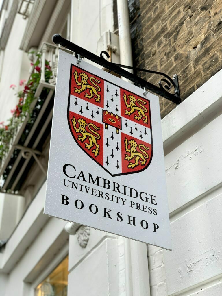
An emblem logo has an air of tradition to it. It consists of words inside an icon such as badges, seals and crests. Because of the more classical feel with a sense of history and experience, you will Often come across them for public organisations, schools and universities or government agencies. Let’s not forget food brands and the motor industry that likes to use emblems to create that extra bit of reliable brand history.
Whilst a lot of them do stand out with their classic appearance, there are some that have stepped across into a contemporary look and feel. The Starbucks logo used to be a great example, although recently, they have lost the name within the logo itself and it’s more of an icon logo now.
Icon or pictorial mark
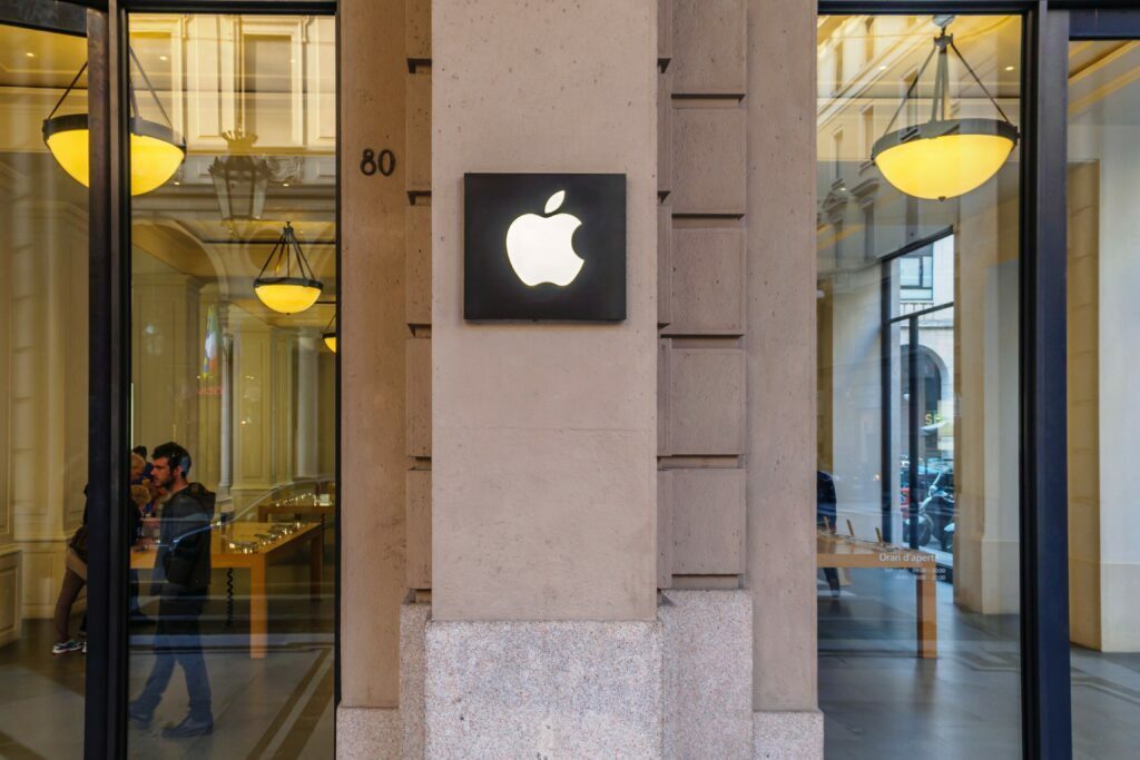
A pictorial mark (sometimes called brand mark or logo symbol) is an icon—or graphic-based logo. Think Apple, Vodadfone, Twitter or Target. With or without the company name, you just know who it is and what they sell because the brand has made that connection between the icon and their product or service. As mentioned earlier, the rise of a brand like Starbucks can be seen by its evolution from emblem to icon, removing the company name from the logo to be stand-alone mermaid-led.
Which icon or picture a business uses very much depends on their brand story. Are they playing on their name, such as Windows or John Deere, or is it showing the meaning of the brand – like Rolex, or the butterfly in the sun for surf.
This icon can also act as a mascot that can have a personality of its own… Think Michelin man or that man from Pringles, Tony the Tiger or Mailchimp.
Abstract symbol
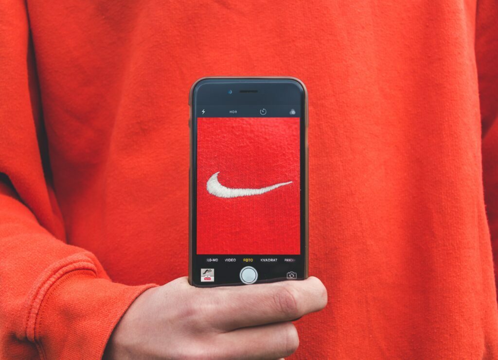
A logo with an abstract symbol is similar to an icon, but it’s not a common icon. As the name suggests, it’s an abstract mark and could be a random, geometric form, a hand drawn symbol, a pattern or splash – anything that reflects and represents your business. There are plenty of examples out there. Brands like Ocado, BP or Nike. Even the Master Card logo and Pepsi are pretty abstract.
Other classic abstract ones are Mind, Cancer research and Firefox. The beauty is in the uniqueness, not being bound to symbols we all know, but to have the ability to create new contextual meaning with powerful, memorable graphics. With any of these, simplicity is key for a number of reasons, such as where the brand identity will be used and what limitations may arise from that – be it that they are printed on a specific material, or engraved, embroidered, printed small- or large scale.
The world is your oyster, but it does have to fit with the menu.
Combination marks
You can also find logos that combine any of the elements above, like NATO or the World Health Organisation, Lacoste or food brands such as Dunkin’ Donuts or slack. In my mind, this is a bit of a blurry line with those, as you can count them in other categories as well and often these days with small screen requirements, brands will have a few different options for their logo.
Unilever’s U mixes letterform and abstract. Apple has both an icon and a wordmark, as does Mercedes-Benz. Airbnb has a cool A/Airplane icon with their company name. Another candidate to eventually lose the words and just use the icon.
There isn’t a rule of thumb for which brand identity should use which logo style. It’s a matter of design and how you reflect the brand values. There are however several factors within your brand strategy and objectives that will guide you towards a particular style.
If you’d like to talk more in-depth about your brand identity or logo design, please drop us a note!

Regine Wilber
I am a brand consultant and conceptual designer. I love using creativity to solve problems for our clients. In my spare time, I like jigsaws and probably a bit of a board game geek.


