If you want to add Adobe fonts to your Adobe spark app to use in branded content and you think the obvious route is to go to ‘brand’ and add the font there, you may look in despair.
Of course you can add your own fonts, but that involves uploading the font files – which with Adobe fonts you can’t do.
It’s only after contacting support that I came across a workaround.
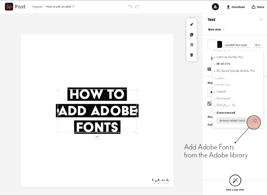
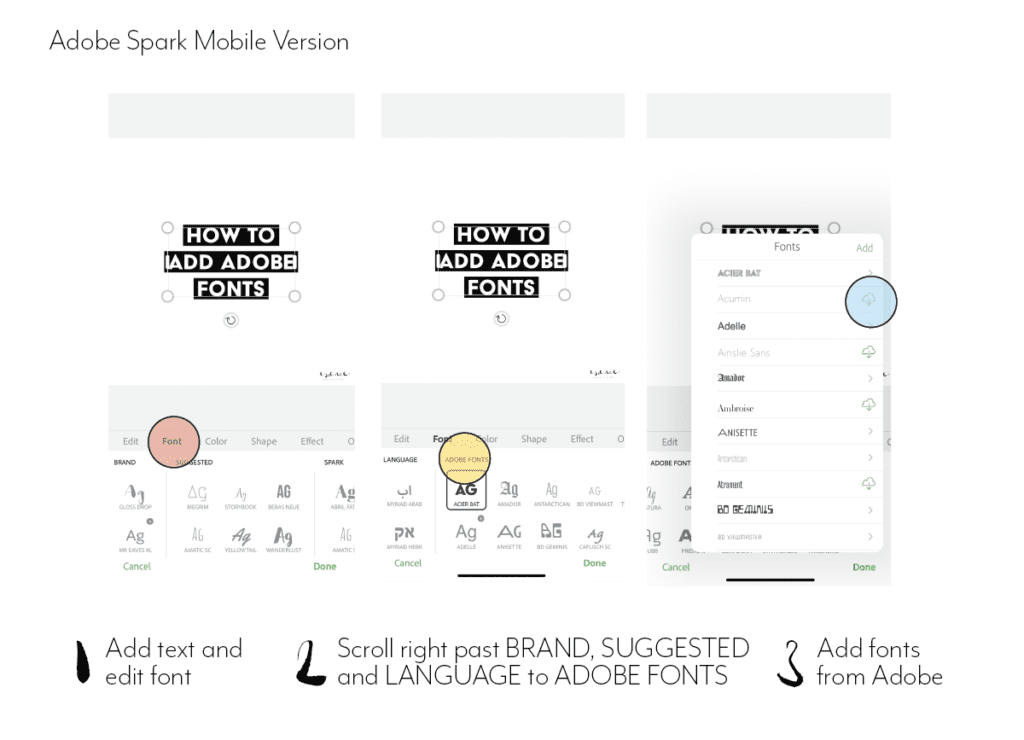
You can’t add the font to the brand templates themselves, but you can add them to text in the post itself.
ON DESKTOPON MOBILE
Add a new post
Go to add text and edit
Find fonts
Scroll down on desktop until you get to Adobe fonts and scroll to the right on mobile to the last panel with fonts.
Activate them and assign them to the text.
Hope this help! And please let me know if you find any other workaround to this!
Both in photography and in typography, the aperture describes an opening. In cameras, its size correlates with how much light goes in. In typography, it’s closely related to what’s called a counter.
As per Wikipedia, a counter is the area of a letter that is entirely or partially enclosed by a letter form or a symbol (the counter-space/the hole of).
Letters containing closed counters include A, B, D, O, P, Q, R, a, b, d, e, g, o, p, and q. Letters containing open counters include c, f, h, i, s etc.
The aperture then is the opening between an open counter and the outside of the letter.
There are also variations. Take lowercase ‘g’ for instance, which has two typographic variants. There is the single-story version which is much seen in sans serifs with one closed counter and one open counter (and hence one aperture). Then there is also a version more often seen in classic typefaces – the double-story which has two closed counters.
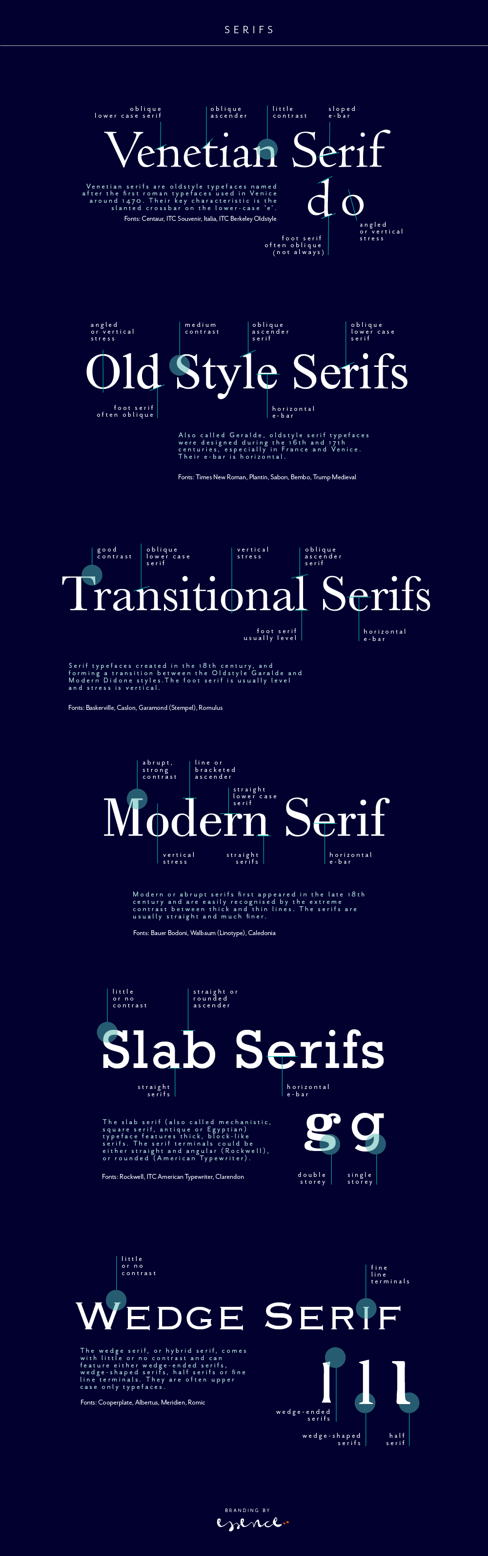
A serif is not a serif, so there are sub categories, pointing to the origin of each class. Serifs can be categorised as Venetian, Old Style (Geralde), Transitional, New Transitional, Modern, Slab Serif and Wedge Serif.
Serif type has its origin in a necessary artefact of stone masonry where Latin words were carved into stone in Roman antiquity. When you work with a chisel, there would inevitably be a starting mark, and the serifs would allow words to appear aligned. The Victorians used serifs in all of their typefaces, and they were common in Italian Renaissance architecture where they were seen as “Roman.”
Serifs remained a distinct feature of certain typefaces long after technology moved type away from stone.
Venetian Serifs
Venetian serifs are oldstyle typefaces named after the first roman typefaces used in Venice around 1470. Their key characteristic is the slanted crossbar on the lower-case ‘e’.
For example: Centaur, ITC Souvenir, Italia, ITC Berkeley Oldstyle
Old Style Serifs
Also called Geralde, oldstyle serif typefaces were designed during the 16th and 17th centuries, especially in France and Venice. Their e-bar is horizontal.
For example: Times New Roman, Plantin, Sabon, Bembo, Trump Medieval
Transitional Serifs
Serif typefaces created in the 18th century, and forming a transition between the Oldstyle Garalde and Modern Didone styles.The foot serif is usually level and stress is vertical.
For example: Baskerville, Caslon, Garamond (Stempel), Romulus
Modern Serifs
Modern or abrupt serifs first appeared in the late 18th century and are easily recognised by the extreme contrast between thick and thin lines. The serifs are usually straight and much finer.
For example: Bauer Bodoni, Walbaum (Linotype), Caledonia
Slab Serifs (Egyptian)
The slab serif (also called mechanistic, square serif, antique or Egyptian) typeface features thick, block-like serifs. The serif terminals could be either straight and angular (Rockwell), or rounded (American Typewriter).
For example: Rockwell, ITC American Typewriter, Clarendon
Wedge Serifs
The wedge serif, or hybrid serif, comes with little or no contrast and can feature either wedge-ended serifs, wedge-shaped serifs, half serifs or fine line terminals. They are often upper case only typefaces.
For example: Cooperplate, Albertus, Meridien, Romic
If you want to read more about type classifications off the beaten track, I can recommend the Typefinder that was written by Sarah Rookledge and Phil Baines (who used to be my tutor at Saint Martins College).
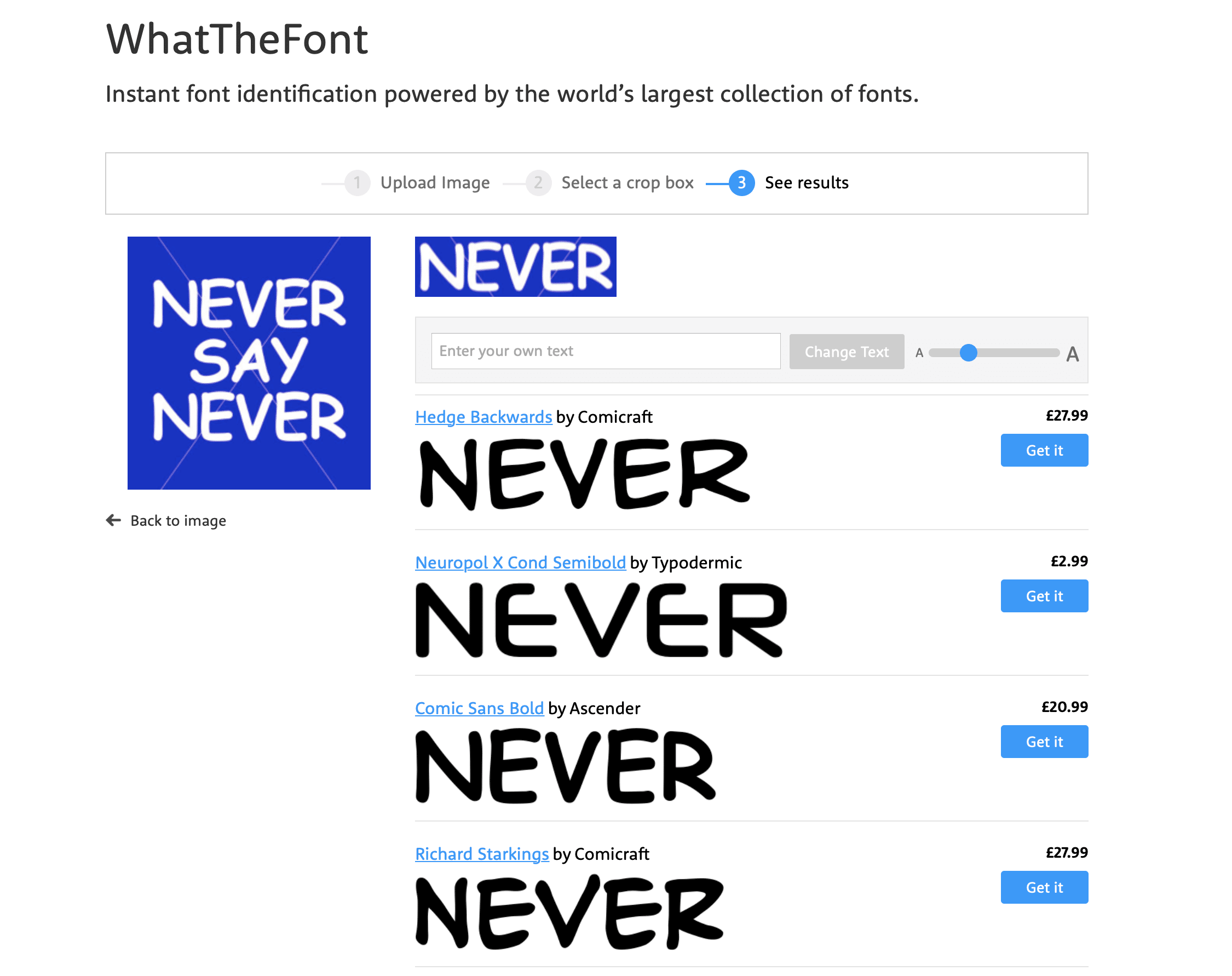
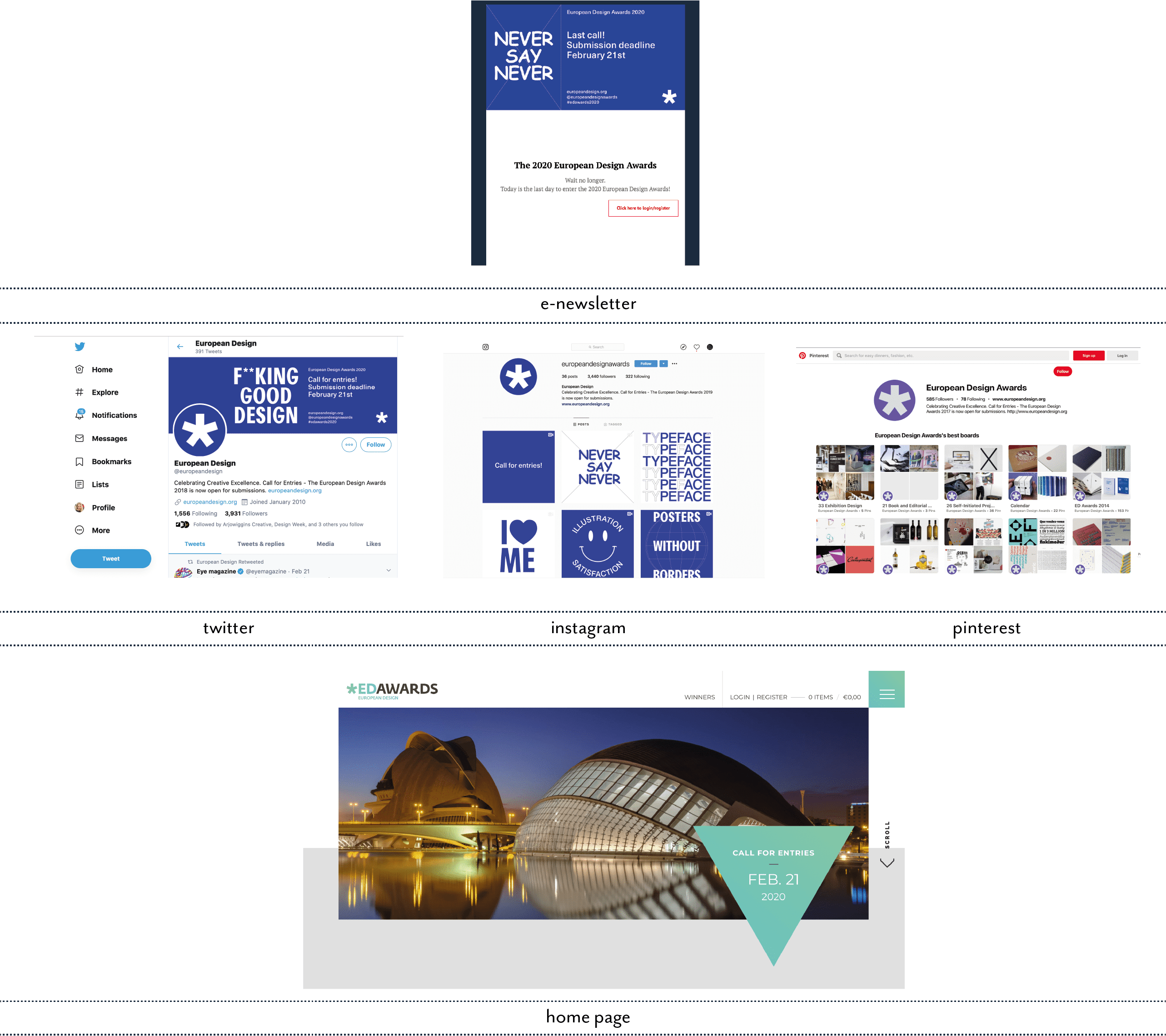
This morning, something dropped in my mail box and I had to look twice, three times even and check my previous emails to see if it really could be true. Did Gmail and Unibox have a serious issue with their font translation? Or is the font of choice for the European Design Awards entry newsletter really Comic Sans – in capitals?!?!!?
In a mild state of shock and disbelief (obviously there are more pressing issues out there than what font an awards organisation chooses to pop in their email header design), but I had to check it out with WhatTheFont and it really seemed to be Comic Sans… Hmmmm.
And then it hit me. Never say never! You can laugh now at just how dumb a moment I’ve had this morning. Their little visual hook was just perfect to get me, obviously gullible and opinionated when it comes to branding and design, to keep reading… so well done, mission accomplished!
My only criticism, I guess, is the fact that the newsletter and their social media look so different from their actual web home page. I think that’s what threw me. It was only when I saw their Instagram that the penny dropped and I could see the method in the madness.
So, after all this, and hanging my head in shame for doubting their taste or typographic sanity, I can only thank them for highlighting once again how critical good typography is for design, no matter which media.
With the amazing tools available today for web, email and obviously print, typography is sadly still very much an afterthought for SME brands with a ‘that will do’ attitude when looking at their marketing and brand collateral.
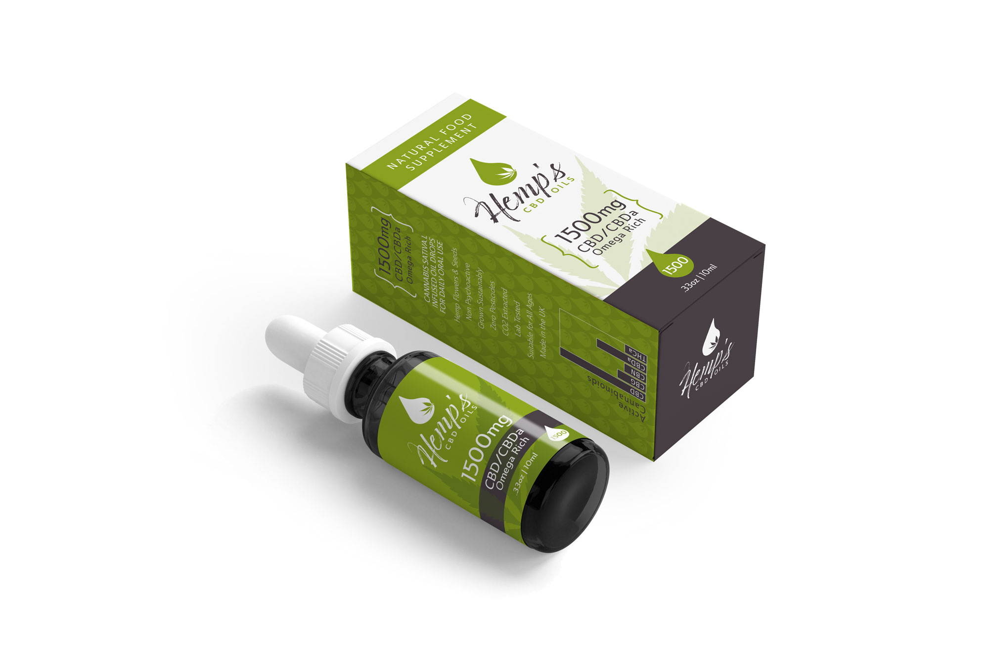
Just finished – a new brand identity for natural food supplement business Hemp’s CBD Oils. This has been a great project to work on, not just because I know the client from other projects for a long time and this is an excitingly different market.
It coincides with another branding project which is also in the natural health area, but more scientific, so it’s been a nice challenge to find the right tone of voice for each of them.
We use cookies and similar technologies to improve your experience on our website.
Read our Privacy Policy.