New brand identity for High-end Tour Operator Luxury Vacations UK
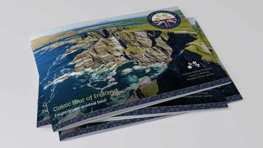
Luxury Vacations UK had outgrown its existing brand we developed for the client over a decade ago. The timing was planned to coincide with a major re-work of the tour operator’s website, as well as their promotional tour guides and the introduction of branded tour videos.
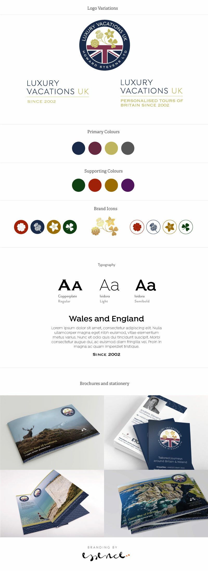
The new brand identity combines the UK’s iconic symbols of England, Scotland, Wales and Northern Ireland together with a classic, luxurious colour palette and visual details to be used in the material.
The re-brand focused on the company’s main audience, visitors from the US, who have cultural expectations and perceptions of the UK as a destination. The brand features a contemporary and non-cliché translation of the company’s values, deeply connected to their highest standards for customer service, luxury accommodation and the tours designed to allow overseas visitors experiencing ‘the real UK’. Delivering engaging, professional and expert tours with chauffeur guides has always been at the heart of the business and shows in the personal writing style of the copy, as well as the eclectic photography showcasing the tours’ highlights.
Using gold foil and a bespoke colour for each of the constituent countries means the brand identity is versatile to branch out into sub brands for regional promotional campaigns whilst remaining a recognisable badge for high quality luxury guided tours in the UK.
The brand has been rolled out across the new website, marketing materials and videos.


Regine Wilber
I am a brand consultant and conceptual designer. I love using creativity to solve problems for our clients. In my spare time, I like jigsaws and probably a bit of a board game geek.


