I’ve just started using Joomla 4 for some new websites and it’s just as easy to use as the older versions. Some things are a bit unexpected, but basically it’s the same as before once you find where everything is packaged.
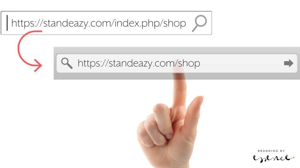
So just a little note for how to get rid of the .index.php from the URLs so they read well for humans and those pesky search engines.
Step 1 – Enable Use URL rewriting in Joomla 4.
From your dashboard, top right there are system short cuts. Find Global Configuration and scroll down until you get to the SEO settings. Enable URL Rewriting.
Step 2 – Change the htaccess file on the server
Get to your files on the server, via ftp or a file manager, and find the htaccess.txt file in the site root folder. Rename it to .htaccess. In my install, that was already there, so I renamed the htaccess.txt into something else and that did the trick.
It’s geeky time again! Let’s talk web tech… If you have a website, you probably know there’s a lot more to the site itself. My clients won’t notice most of these extra things to think about when setting up a site.
And I’ve got a lot of little helpers that make the web process smooth sailing. Here’s a quick roundup of some of my faves.
Some are available as plugins especially for WordPress, which has so many little nifty tools. These here are all available as web services though so use whatever system you’re into.
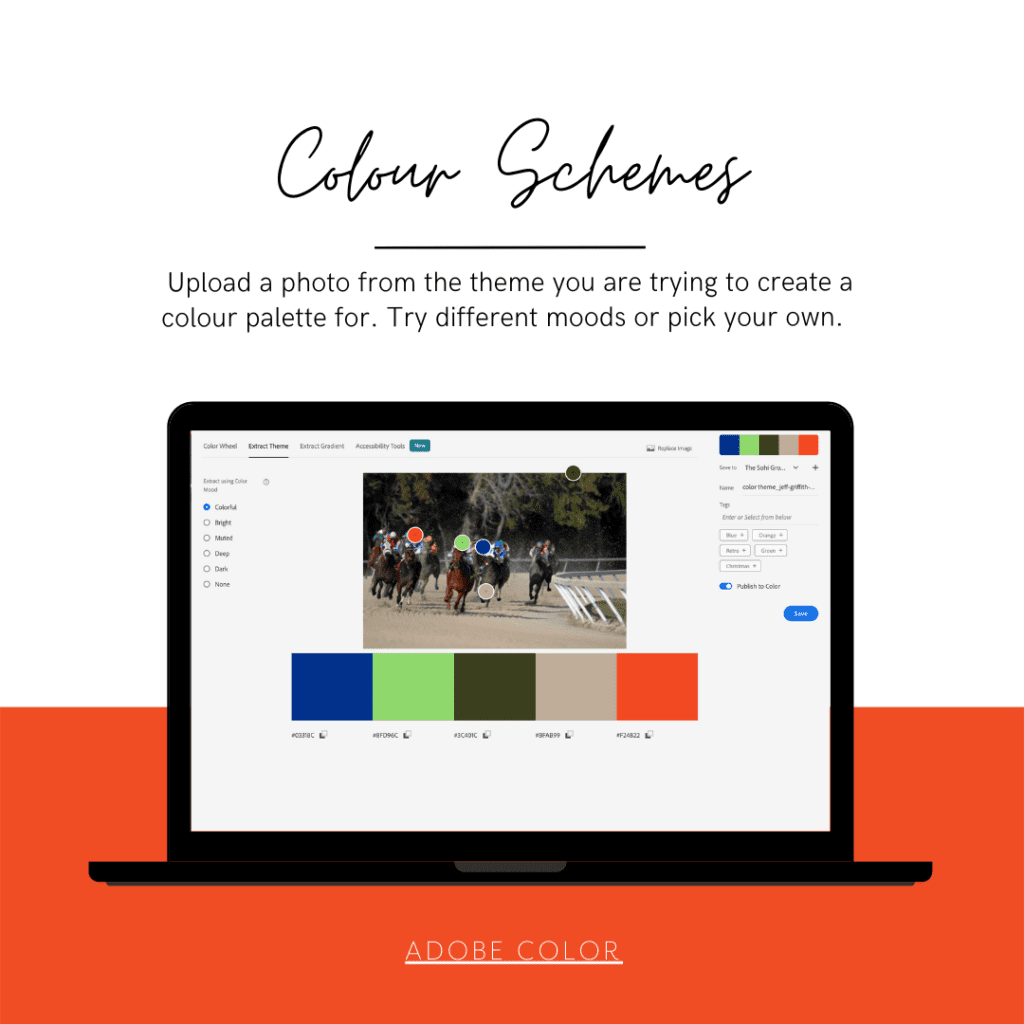
Adobe Color
Looking for the perfect colour palette for your website? Many designers spend countless hours trying to come up with the right palettes. Fortunately, there’s an excellent tool that can help you — and it’s free. Adobe recently launched a new site called adobe color (http://color.adobe.com) which takes advantage of Adobe Kuler’s (another free tool) colour wheel to provide you with a series of beautiful colour combinations.
You have the choice to use the colour wheel to define complimenting colours with different pre-sets:
Analogous
Monochromatic
Triad
Complementary
Split complementary
Double split complementary
Square
Compount
Shades
Custom
The one I love the most is Extract Theme where you upload a photo or graphic to pick the colours from – again with handy presets. You can opt for the colourful, bright, muted, deep, dark or your own.
Once you have a colour, it’s also really handy to see it in action as a gradient. Again, something you can do with Adobe Color. And if you are catering for higher accessibility, voila! Check out the colour blind simulator.
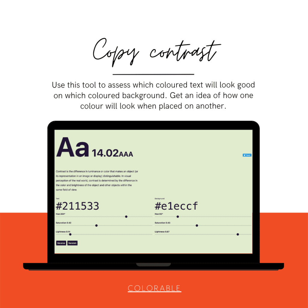
The human eye can distinguish about 10 million different colors. But we’re not able to spot every nuance out there. That’s where contrast comes in. Contrast is the difference in luminance or color that makes an object distinguishable from another. Contrast is important because it determines whether an object stands out from the background, or if it blends in.
Colorable helps you test different colours ‘on top of each other’, looking how a font colour will appear on different background colours.
XML sitemaps are a good idea no matter what, but they’re particularly important for sites with large numbers of pages. If you’re running a large site, you might have hundreds of thousands of pages, and manually submitting each one by hand to search engines would be a time-consuming and potentially error-prone task. XML sitemaps can simplify the process.
Plugins such as Yoast for WordPress or OSMap for Joomla run websites can be used ‘on site’ as well, but if you don’t want plugins, this site map generator is quick and effective.
A whole other section worth mentioning – Google Search. Here you can use your XML Sitemap. When you submit your site in the console, it will also alert you to any issues with pages, links, breadcrumbs etc. It’s a rabbits hole but in its basic functions it’s very useful for helping with SEO.
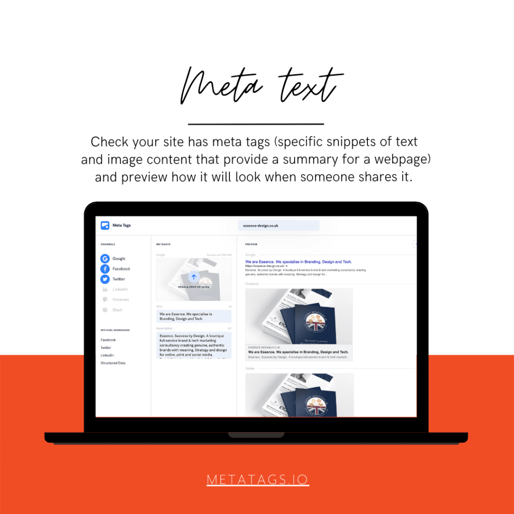
Meta tags are invisible text that helps search engines understand what your webpage is about. For example, meta description tags are the short, 150-character snippets that appear next to a search result. These help users decide whether or not to click through to your page. This website shows you how you can edit and experiment with your content and previews how your webpage will look on various social media channels.
Again, plugins such as Yoast for WordPress solve this issue neatly, but some parts are limited to the premium version. Meta tags is free to use.
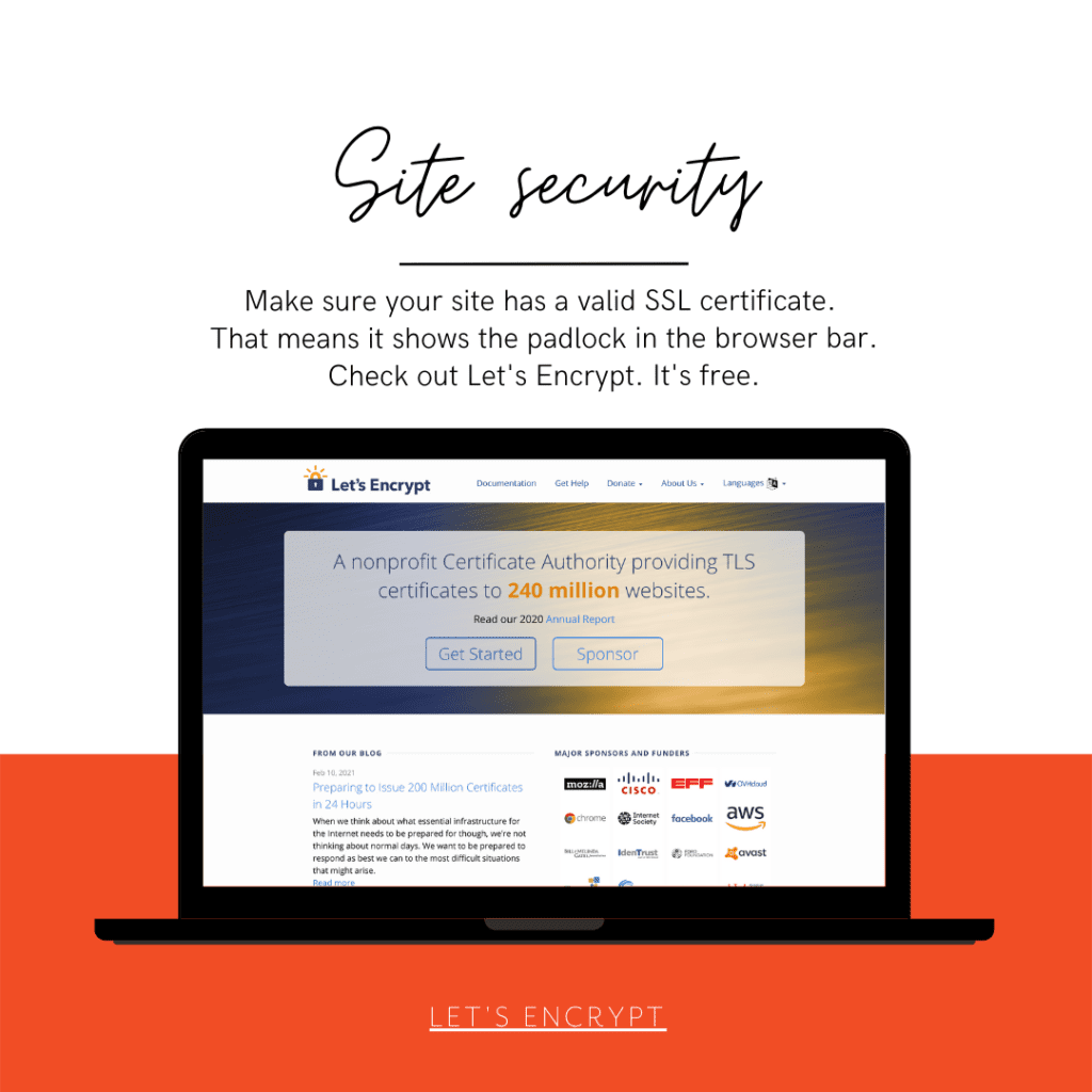
Let’s Encrypt is a Certificate Authority that provides free TLS certificates to millions of individuals and organizations operating in nearly every country around the world. They’re a nonprofit with a mission to encrypt the entire Internet. They help their users set up HTTPS websites so that everyone can benefit from encryption, from users browsing the web to admins managing servers.
Most good web hosts will integrate let’s encrypt so you shouldn’t have to worry about a thing. Just check that your hosting package comes with a free SSL certificate and that you have the padlock on your url starting with https.
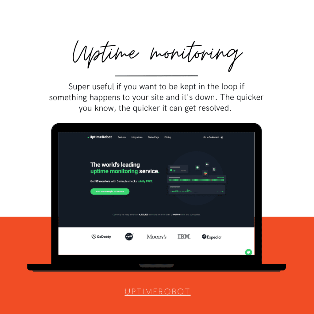
Do you know what will happen to your business if your website is down? Up to 30% of all visitors will abandon your website if they can’t access it. This makes the reliability of your website extremely important to your overall success as an online entrepreneur.
No system is perfect, and websites will go down at some point for some reason or another. What’s important is that you find out and are able to react quickly. We monitor the websites we host for clients for exactly that reason. This site monitor is free for up to 50 sites, making it great for SMEs to ensure their online presence is being watched out for.
There are lots more tools out there, of course. And I already have a list in mind of some services that make SEO and the finer details of your website so much easier.
Let us know if you want to talk more about your website design, development or hosting, we will be happy to help.
I just mentioned a paragraph I have in our brand strategy workbook to my other half, techy Steve, and he taught me yet another new thing. Duck typing! (“Duck typing in computer programming is an application of the duck test—”If it walks like a duck and it quacks like a duck, then it must be a duck”—to determine if an object can be used for a particular purpose. With normal typing, suitability is determined by an object’s type.” Wikipedia)
Our brand strategy workbook talks about why you should bother with a brand strategy: “If it looks like a duck, swims like a duck, and quacks like a duck, then it probably is a duck.” With a good strategy, you make sure your duck isn’t suddenly featuring a shark fin and razor sharp teeth hunting little chicks…
I like it when tech and design share the same sentiments.
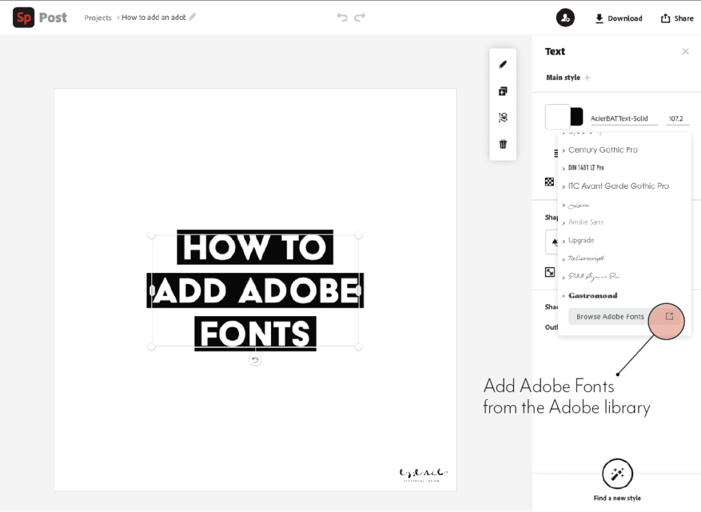
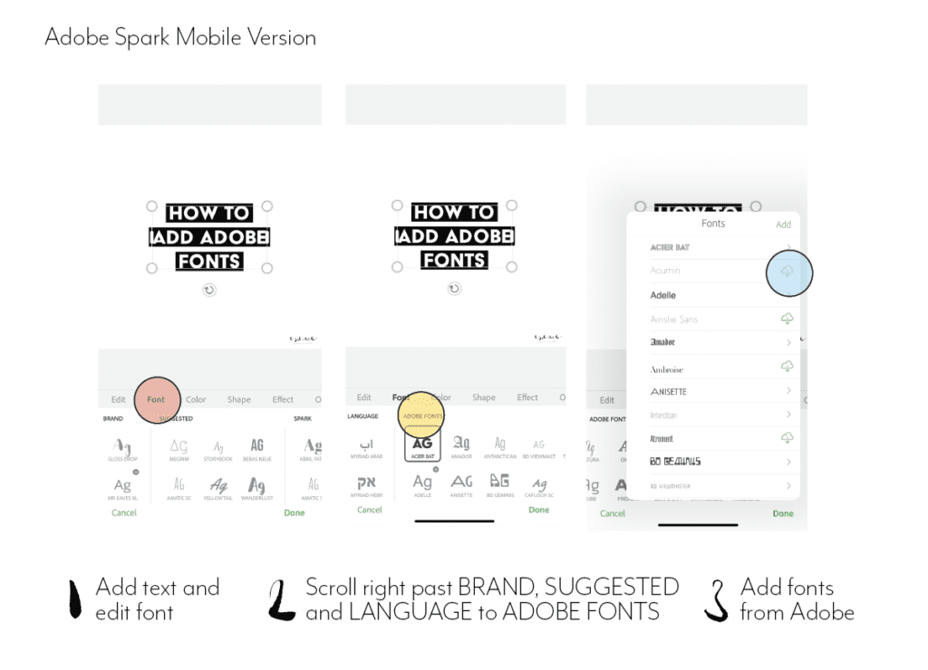
If you want to add Adobe fonts to your Adobe spark app to use in branded content and you think the obvious route is to go to ‘brand’ and add the font there, you may look in despair.
Of course you can add your own fonts, but that involves uploading the font files – which with Adobe fonts you can’t do.
It’s only after contacting support that I came across a workaround.
You can’t add the font to the brand templates themselves, but you can add them to text in the post itself.
ON DESKTOPON MOBILE
Add a new post
Go to add text and edit
Find fonts
Scroll down on desktop until you get to Adobe fonts and scroll to the right on mobile to the last panel with fonts.
Activate them and assign them to the text.
Hope this help! And please let me know if you find any other workaround to this!
Both in photography and in typography, the aperture describes an opening. In cameras, its size correlates with how much light goes in. In typography, it’s closely related to what’s called a counter.
As per Wikipedia, a counter is the area of a letter that is entirely or partially enclosed by a letter form or a symbol (the counter-space/the hole of).
Letters containing closed counters include A, B, D, O, P, Q, R, a, b, d, e, g, o, p, and q. Letters containing open counters include c, f, h, i, s etc.
The aperture then is the opening between an open counter and the outside of the letter.
There are also variations. Take lowercase ‘g’ for instance, which has two typographic variants. There is the single-story version which is much seen in sans serifs with one closed counter and one open counter (and hence one aperture). Then there is also a version more often seen in classic typefaces – the double-story which has two closed counters.
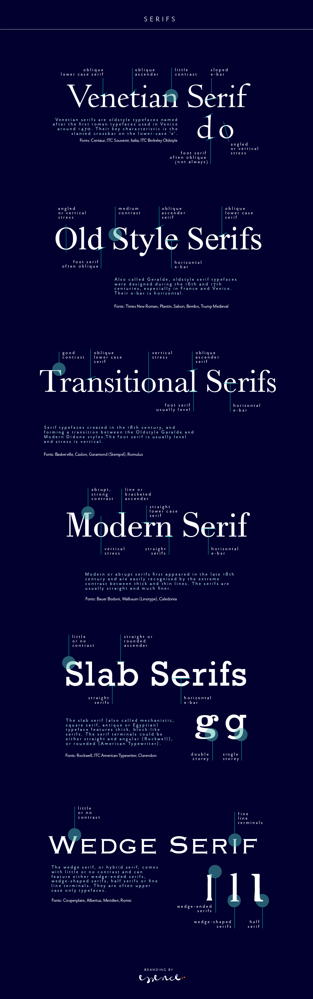
A serif is not a serif, so there are sub categories, pointing to the origin of each class. Serifs can be categorised as Venetian, Old Style (Geralde), Transitional, New Transitional, Modern, Slab Serif and Wedge Serif.
Serif type has its origin in a necessary artefact of stone masonry where Latin words were carved into stone in Roman antiquity. When you work with a chisel, there would inevitably be a starting mark, and the serifs would allow words to appear aligned. The Victorians used serifs in all of their typefaces, and they were common in Italian Renaissance architecture where they were seen as “Roman.”
Serifs remained a distinct feature of certain typefaces long after technology moved type away from stone.
Venetian Serifs
Venetian serifs are oldstyle typefaces named after the first roman typefaces used in Venice around 1470. Their key characteristic is the slanted crossbar on the lower-case ‘e’.
For example: Centaur, ITC Souvenir, Italia, ITC Berkeley Oldstyle
Old Style Serifs
Also called Geralde, oldstyle serif typefaces were designed during the 16th and 17th centuries, especially in France and Venice. Their e-bar is horizontal.
For example: Times New Roman, Plantin, Sabon, Bembo, Trump Medieval
Transitional Serifs
Serif typefaces created in the 18th century, and forming a transition between the Oldstyle Garalde and Modern Didone styles.The foot serif is usually level and stress is vertical.
For example: Baskerville, Caslon, Garamond (Stempel), Romulus
Modern Serifs
Modern or abrupt serifs first appeared in the late 18th century and are easily recognised by the extreme contrast between thick and thin lines. The serifs are usually straight and much finer.
For example: Bauer Bodoni, Walbaum (Linotype), Caledonia
Slab Serifs (Egyptian)
The slab serif (also called mechanistic, square serif, antique or Egyptian) typeface features thick, block-like serifs. The serif terminals could be either straight and angular (Rockwell), or rounded (American Typewriter).
For example: Rockwell, ITC American Typewriter, Clarendon
Wedge Serifs
The wedge serif, or hybrid serif, comes with little or no contrast and can feature either wedge-ended serifs, wedge-shaped serifs, half serifs or fine line terminals. They are often upper case only typefaces.
For example: Cooperplate, Albertus, Meridien, Romic
If you want to read more about type classifications off the beaten track, I can recommend the Typefinder that was written by Sarah Rookledge and Phil Baines (who used to be my tutor at Saint Martins College).
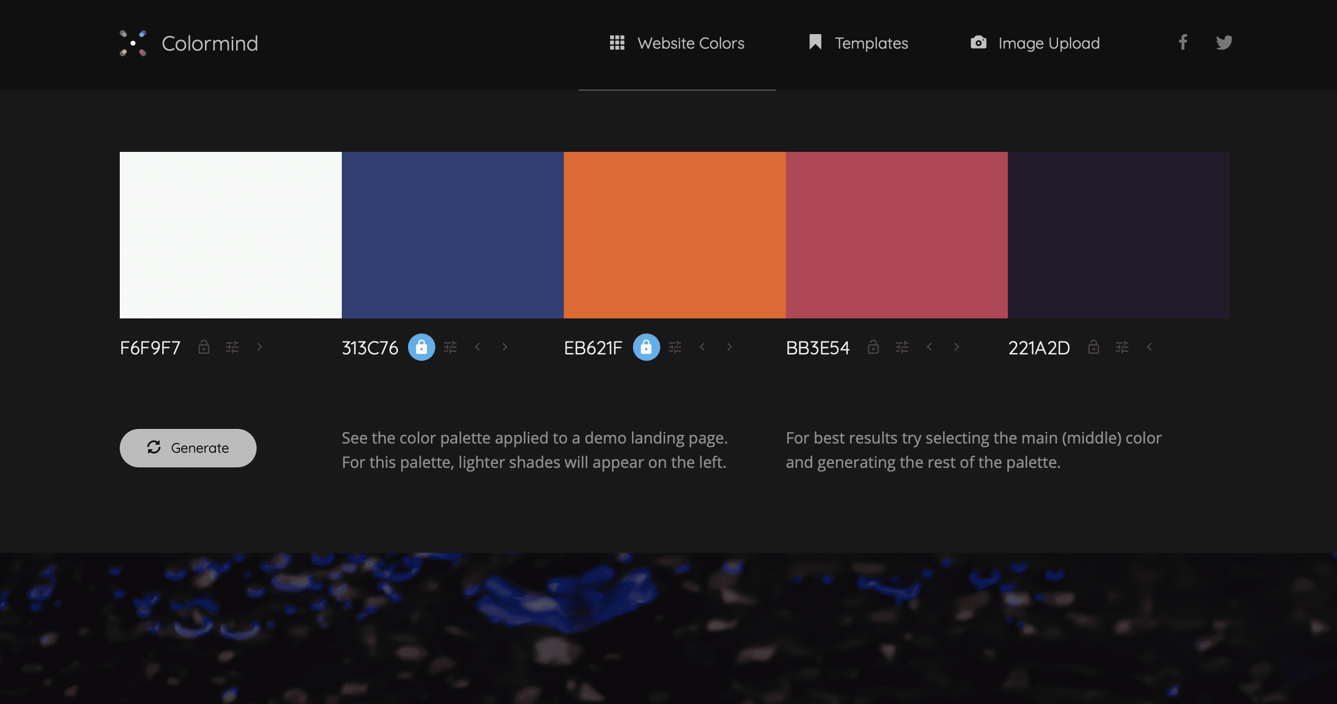
Fast becoming one of my favourite colour palette sites is http://colormind.io (Yes, they should have an ssl certificate, but I don’t think they will steal your date – you can just use it as a tool and don’t have to give away your personal info).
The site uses AI to generate however many additional colours you need for your palette. You can define some core ones you want to definitely keep and it will ai its way around those to match with other options. It’s a great way to test contrast and appeal on actual elements, see what it feels like without having to apply it to your web theme yet.
It’s perhaps meant to be an introduction for the products linked to it which allow you to create pages with Material Kit – but I am using it for the colours itself. Thank you Jack!
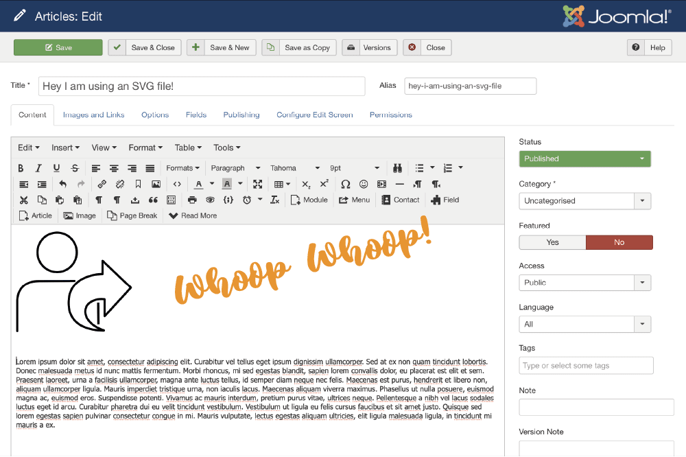
SVGs are super exciting especially if you are working with platforms that allow animating strokes and controlling the svg file with css. It’s also really convenient to have super sharp logos in a very small file size on your site. Speed is so important…
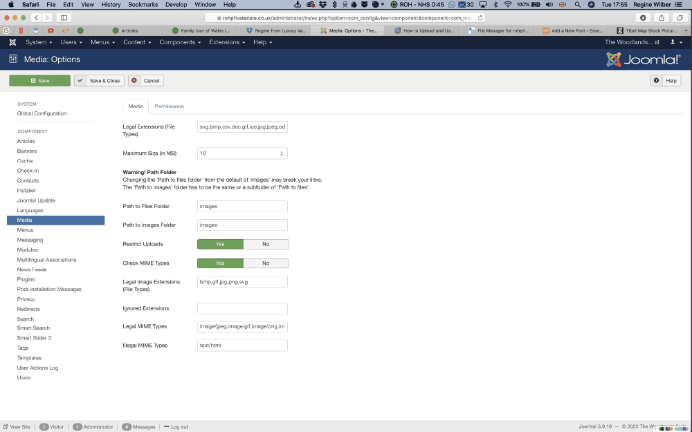
But with the security settings of Joomla, it’s not straight forward to get an svg file onto your site. If you think you can bypass the issue by going into global configuration for media and adding the extension to the list of allowed file types. You can do it, but you will promptly be ignored by the system.
So here is a workaround on using svgs on Joomla. (Obviously only use your own files where you know you’ve not added extra code that may compromise your site. )
Step 1
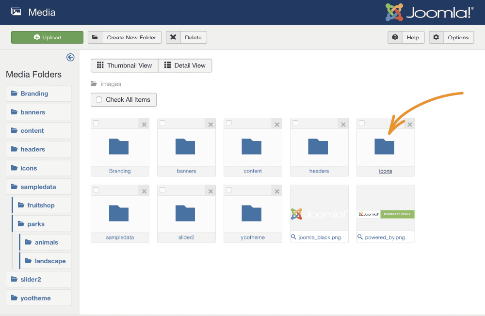
Create a folder in media to store all your files in. The standard folder is /images so somewhere in there is efficient.
Step 2
Access the files via FTP or a file manager. You can use something like FileZilla or go onto your host site and go through the file manager. Upload your svg files onto the server.
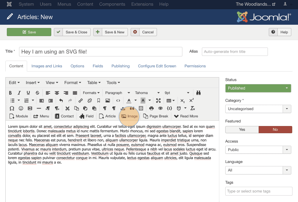
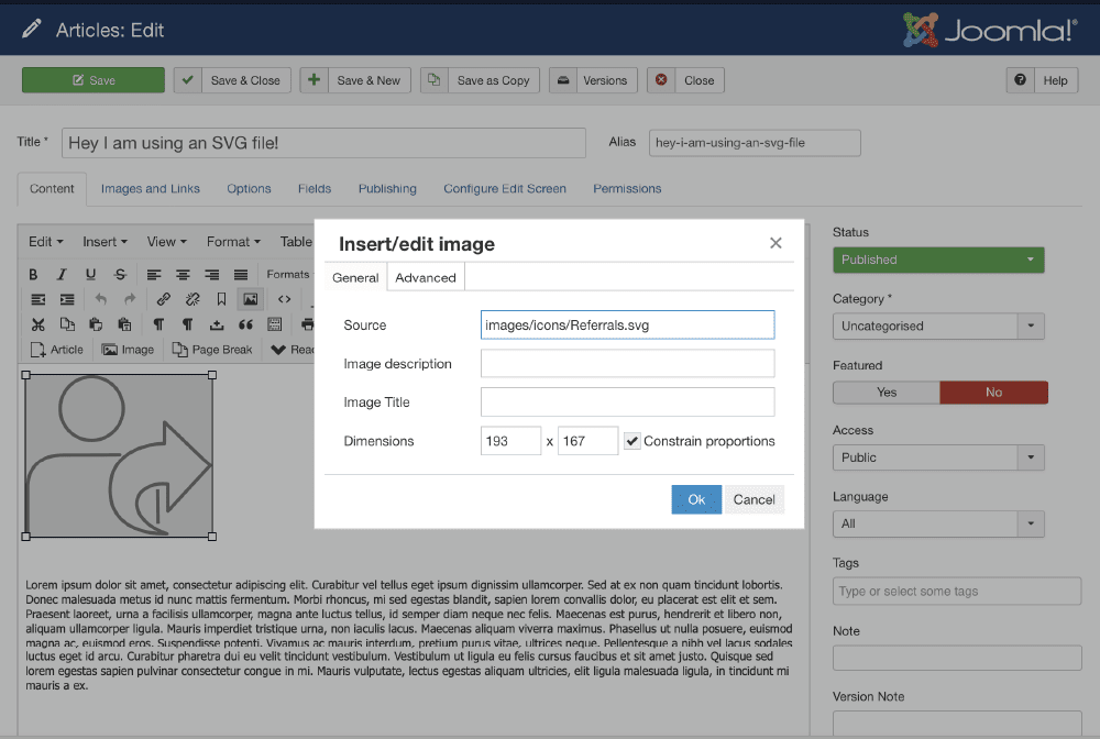
Step 3
Now it depends whether you are using a platform that supports SVG or you have to input the path directly into the media area if you are in joomla directly.
If you ever need to restore a backup with Akeeba Kickstart, follow their documentation video from their website and before you click ‘run the installer’, read this:
If you have ever tried to run the installer and it says “The installer is locked”, there is something else you need to do first. After extracting the backup archive with Kickstart and before you click on the “Run the Installer” button connect to your site with FTP or SFTP. Delete the file installation/password.php. Now the installer will be unlocked.
You can use a programme such as Filezilla to ftp onto the site. Then, look in the installation folder for the password.php file.
On this sample, it was in controllers in installation / angie – I’ve renamed the file to June-password.php just in case I had to have it again but that worked.
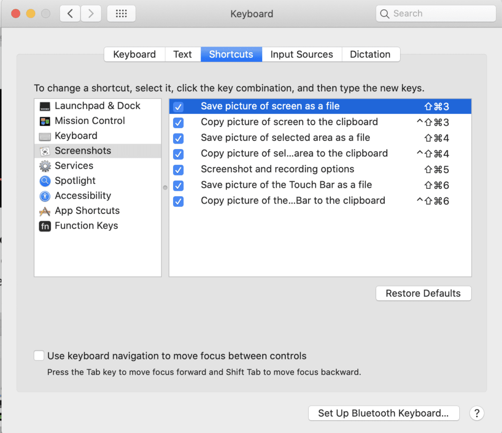
Whether you are trying to put together a presentation or you want to share a bit of news in an email – or you are trying to present some creative work to a client – screen caps are super useful to capture and explain – well – screens…
On a Mac you used to have this wonderful shortcut of command, control + shift and 4 (which is a bit of a hand full, but well worth the finger acrobatics) and you can start dragging across an area of the screen to take a snap which gets copied into your clip board. So from there you can easily add it to your powerpoint or publishing software without having to go through import processes. Unless you design for print, the quality should be fine.
If you have a Mac with a touchpad, you get a neat little interface asking you if you want to drag across the screen yourself or you want to capture a specific window or just the entire screen. Then you can also specify if your destination is the clipboard, documents, desktop or preview.
If you want to always save your screen caps in a specific location, or if you want to specify a custom location, you can do that, too.
First, click Command + Shift + 5 and your screen will go faded out with a little menu at the bottom. I’ve made a little screen recording of the function to demonstrate.
Once you’ve set this up, you can use the short cut to access that menu. You can go even further than this by checking the absolute short cuts in system preferences.
It seems to follow the rule of save to file with command, shift and a number plus option if it’s for the clip board. Definitely one to work with.
When you are in photoshop and want to just quickly open bridge to look at a bunch of pictures you may want to use, it’s a little shortcut that comes in handy: Command + Shift + O. It’s a bit weird cause it looks like nothing happens but then it pops up.
Why would you use bridge?
Bridge is a digital asset manager, or a media manager, which kind of sums it up. It also implies that it’s not just for photos, but for any creative assets, videos or sounds etc. You can view, sort, rate and assess your media in a number of views. The name Bridge gives it away as well – it’s not just a companion for photoshop, it works for InDesign and Illustrator and other Adobe tools, too. Like a bridge over hopefully not troubled water…
Here is a link to Adobe Bridge if you want to have a snoop around.
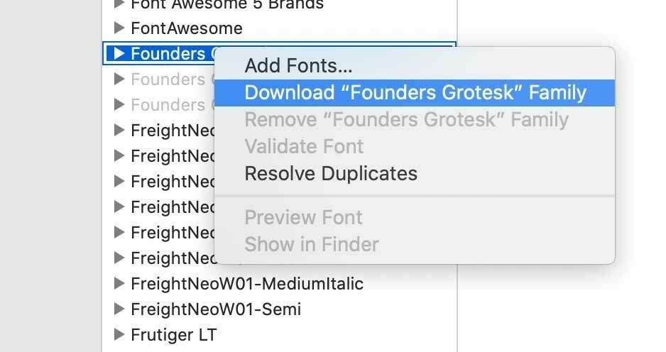
When you get to your FontBook app and click on ‘All Fonts’, you will notice that some of them are greyed out. It’s really easy to unlock them though, all you need to do is to right-click on a greyed out name and then on ‘download font’ and et voila, you have the selected font or font family installed.
Quick Screen Recording of the process
You can either select the fonts one by one or pick a bundle.
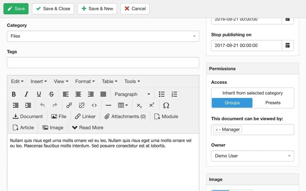
Amidst the current corona crisis, one of my clients needed a quick fix to communicate some potentially scary documents with their staff without alerting the public, and they didn’t have an intranet.
We had a brainstorm to look at the existing website capabilities without the need to setup a separate login area and to minimise admin, and DocMan from Joomlatools had the required features.
One option was to stop search engines from indexing the documents on the website. You can see here how to stop indexing.
The perhaps better option however was to also lockdown the documents completely to a user group that would only internally be granted access. So we set up a new access level with viewing permissions specifically for this type of documents. You can see how to lock down documents in DocMan here.
That way, no second system is required, and a shared internal login makes the access relatively easy.
Ultimately, a user based registration process that can enable and disable staff access is obviously the preferred solution but as a quick fix that worked for them.
It’s also called a slide master in Microsoft PowerPoint, and it’s basically the slide that sits above all the other slides and as such it controls the visual elements of the theme, such as the layout, background, colours, fonts, and also where these are positioned on any slides you create within that theme.
That way, you can create a consistent look and feel for your presentation.
Beware, there are limitations to how clever the slide master is compared to other publishing software with the same concept of master pages (such as InDesign). In PowerPoint you can’t position elements on the slide master to be on a certain layer (above or below) in relation to elements on the actual slides. But those little niggles are more for your graphic designer to fight with 😂 and hopefully your template will be set up so you can easily work with it to create a consistent look for your brand material.
You can read more about slide masters here at the Microsoft Support site.