
Category: Graphic Design

Creative thinking in a Birmingham graphic design studio

The art of patience: mastering time for better creative thinking

Have you ever felt that rush of excitement when you’re handed a new design brief? That sense of eager anticipation mixed with a dash of creative anxiety as you ponder over where to begin? If you’re nodding along, then welcome to the club. You see, there’s this peculiar phenomenon I’ve noticed over my two decades as a creative professional, and it’s something that consistently emerges, no matter the project at hand. It’s about the journey of creative thinking from initial concept to final masterpiece, and the surprising role patience plays in this process.

Let me take you on a little field trip, a kind of behind-the-scenes tour of the creative process, if you will. It starts with a design brief landing on my desk. Now, you’d think after 20 years, I’d just dive straight in, right? Whip up a logo, sketch out a website design, or craft a brand strategy in no time. And sure, I could do that. In fact, sometimes I do. But here’s the kicker: the real magic, the kind that makes you lean back in your chair and go, “Wow, did I just create that?” happens under a different kind of tempo. It’s what I like to call the slow burn.

The Slow Burn of Creative Thinking

This slow burn during the creative design process isn’t about dragging your feet or procrastinating (though, let’s be honest, we’ve all been there). It’s about giving yourself permission to sit with the brief, to marinate in the problem, and to let your ideas simmer and evolve. In the world of instant gratification, where deadlines loom like thunderclouds and clients are itching for quick fixes, advocating for patience in creativity might seem, well, a bit out of place. But bear with me.

The Case for Patience

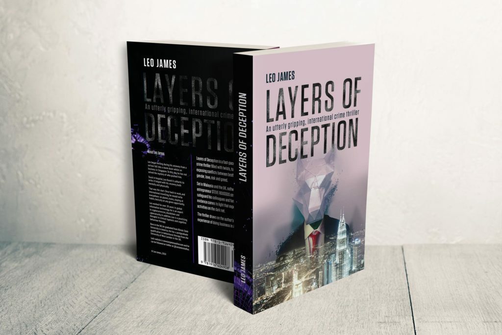
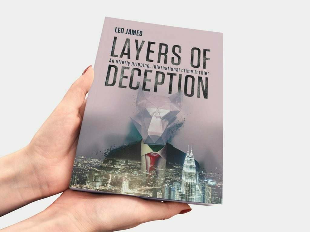
Over the years, I’ve learned something vital: good designs, the kind that resonate and endure, require patience. Not just with the process, but with yourself. It’s about allowing yourself the time to refine and improve a composition, to tweak a logo until it sings, to strategise a brand’s identity until it feels just right, or to polish a website design until it shines.

You see, creativity is not a faucet you can just turn on and off at will. It’s more like a river that needs to meander, to find its course. Sometimes, it flows freely; other times, it hits a snag. But given time, it always finds its way. And this is where patience becomes your ally in the creative process.

Expanding on the metaphor of creativity as a meandering river, there are also loads of creative thinking strategies that will help that river to flow, especially when it hits a snag. These strategies are like the tools we use to gently guide the river along its course, helping it navigate through obstacles and expand its banks to explore new territories.

One such strategy is lateral thinking, a technique that encourages looking at problems from new angles, often leading to unexpected and innovative solutions. It’s akin to finding a new tributary for our river to explore, one that might initially seem unrelated but ultimately leads to a richer, more diverse creative landscape.

Another useful approach is the SCAMPER technique, which stands for Substitute, Combine, Adapt, Modify, Put to another use, Eliminate, and Reverse. Each of these verbs offers a different way to approach a creative block, encouraging us to rethink and reframe the elements of our design, pushing us to think outside the box and discover novel solutions.

Mind mapping is yet another tool in our arsenal, allowing for the visual organisation of thoughts and ideas. It’s like creating a map of the river’s potential paths, helping to clarify the direction of flow and uncover connections between seemingly disparate ideas. This strategy fosters a free-flowing exploration of concepts, making it easier to navigate the creative process.

Lastly, embracing constraints can paradoxically free our creativity. Limitations, whether in time, resources, or specifications, can force us to be more inventive, finding ways for the river to flow despite barriers. It’s a reminder that creativity thrives not just in open, unbounded spaces but also within the confines of a challenge.

In our upcoming post, we’ll delve deeper into these strategies and more, exploring how they can help us think outside the box and guide our creative river to its fullest potential. These approaches, combined with the patience to let our creativity unfold naturally, ensure that the creative process is not just about reaching a destination but also about enjoying the journey and discovering the wealth of ideas that lie just beyond the familiar banks.

The Creative Epiphany

Now, back to that design brief. After allowing the initial ideas to percolate, something crazy happens. You go over the brief, the problem, the task again and again. And then, suddenly, it all falls into place. It’s as if all the pieces of the puzzle you didn’t even realise were scattered suddenly come together to form a coherent, beautiful picture.

This moment, this creative epiphany, is what every designer lives for. It’s the culmination of all your experience, your skill, and, yes, your patience, coming together in a moment of pure clarity. It’s the realisation that good things really do come to those who wait, who ponder, who refine, and who dare to revisit the drawing board as many times as it takes.

The Value of Experience

Now, you might be wondering, does experience speed up this process? The answer is yes and no. With experience comes a certain level of efficiency, a knack for identifying potential solutions more swiftly. However, the quest for that breakthrough idea, the one that elevates your design from decent to extraordinary, remains a journey. And it’s a journey that cannot be rushed.

Experience has taught me that while I can produce something relatively quickly, the depth, the nuance, and the impact of my work significantly improve when I allow myself the luxury of time. Time to question, to explore, to experiment, and to ultimately uncover the best solution hidden within the brief.

I know that the reality of deadlines, budgets and client expectations isn’t always your friend when it comes to slowing down, but it’s worthwhile explaining to clients why some things take longer than others, and what the merit of giving a project the time it deserves is in relation to the ROI. I feel fortunate to work with professionals that understand this but it wasn’t always like this. I have probably lost some clients over it over the years who were looking for quick fixes rather than complete solutions, but it did mean that I can focus on those clients and projects that are ultimately far more exciting and long-lasting. It’s a two way street… It’s the client commissioning you, but it’s also you giving your talent to a client. Don’t undervalue that.

Embracing the Process

So, to my fellow creatives, whether you’re just starting out or you’ve been in the game for years, embrace patience. Embrace the slow burn of creativity. Allow yourself the space to explore, to fail, to learn, and to grow. Remember, great design is not just about the end product; it’s about the journey you take to get there.

In a world that often values speed over substance, especially with the rise of AI tools for content creation, choosing to take your time might seem counterintuitive. But trust me, the results speak for themselves. When you give yourself permission to slow down, to let your creative juices flow at their own pace, you unlock a level of creativity and innovation that quick fixes can never achieve.

The Takeaway

I hope you’re feeling inspired to approach your next project with a newfound appreciation for the role of patience in design. Remember, it’s not just about crossing the finish line; it’s about enjoying the ride, learning from the detours, and ultimately arriving at a destination that’s truly worth the journey both for you and for your client.

So, the next time you’re handed a design brief and feel the pressure to deliver quickly, take a moment. Breathe. Reflect on the power of patience and the incredible potential it holds to transform your creative work. Trust yourself and your education, your talent and your experience that things will fall into place, the picture will be completed and you will solve the brief.

Good things—no, great things—come to those who wait. And in the realm of creative design, patience is, without a doubt, a virtue worth cultivating.

JBC-Skills-Banner-stand-design and print

It’s a wrap.

This year we’ve been able to get back to designing for actual ‘live’ events, with exhibitions starting to make a come-back after ‘you know what’. It’s been great working on different roller banner designs for companies trying to attract visitors to their stands.

Here’s just a couple of examples from recent expos. What was important in both instances was to keep it simple, to make messages clear and easy to read and to link to the websites for more information. Whilst there used to be a notion of having to tell just about every little detail on one single page, ending up with over crowded and frankly ugly looking visuals, we now have the luxury of being able to bridge from the physical to online with QR codes and similar scannable links.

You can use the canvas to create a visually powerful introduction and guide people to more info online. It’s so much better than having to squeeze in too much to give a design layout a chance to breath.

If you’d like some fresh banner designs, get in touch!

Hand pointing to URL that has been rewritten by Joomla

Joomla 4 – how to get rid of index.php from your URLs

I’ve just started using Joomla 4 for some new websites and it’s just as easy to use as the older versions. Some things are a bit unexpected, but basically it’s the same as before once you find where everything is packaged.

So just a little note for how to get rid of the .index.php from the URLs so they read well for humans and those pesky search engines.

Step 1 – Enable Use URL rewriting in Joomla 4.

From your dashboard, top right there are system short cuts. Find Global Configuration and scroll down until you get to the SEO settings. Enable URL Rewriting.

Step 2 – Change the htaccess file on the server

Get to your files on the server, via ftp or a file manager, and find the htaccess.txt file in the site root folder. Rename it to .htaccess. In my install, that was already there, so I renamed the htaccess.txt into something else and that did the trick.

The result: Beautiful short URLs.

Enjoy!

Sutton Coldfield design studio

What running a Sutton Coldfield design studio & brand consultancy taught me

It started with some short cuts…

Everybody has different paths to their chosen career. And everyone will have different experiences with self-development professionally and personally. Education has always been important to me as a designer. From the moment I entered the creative scene in London, to now where I am the creative director of a Sutton Coldfield design studio, keeping myself skilled-up is a key element of my working week.

Graphic design and brand consultancy may be based on talent, but it’s hard to be a good designer without additional skills in software, technology, understanding businesses…

Sutton Coldfield design studio and brand consultancy

When I was an artworker at a London design agency, every lunchtime I stayed in and basically hacked on a scrap document to learn what could make my typesetting faster. Soon, I was the person that would know a shortcut key if there was one. It helped being recognised as a valuable team member and it felt like the right thing to do. Back then we used Quark, and Adobe was that new thing that made pdfs that would embed fonts, oh wonder! I guess I was lucky to start my career at a time when software started to change the creative industry in a storm.

Two years on, I was studying at Central Saint Martins whilst working freelance. I’d spend most of any spare time in libraries going through books about advertising, graphic design, interior design, typography, colour theories, human behaviour, communications – and how to run a business. 

Learning from running our Sutton Coldfield design studio and brand consultancy

As soon as I transitioned to working full time as a designer, it fascinated me how we’d end up with those briefs to design a brand identity. What If there was another way to shape that brand? So off I went again to Brunel University to do a course on brand strategy.

And on it goes – workshops, networking mastermind sessions, online tutorials… all the way to starting our Sutton Coldfield design studio back in 2005. To be fair, Essence is probably not a regular graphic design studio: Steven, the other half, is super tech-focused, our data meister and the man that taught me all about CSS, JS, JSON, HTML, how to troubleshoot, and how to comment on code. And I come from a highly conceptual, ideas-focused advertising background with a passion for typography, print technology, copywriting, and using photography to tell a brand story in different media. We like to call Essence a brand consultancy for those reasons.

Even now, more than 16 years in business here, my motto remains: ‘Every day is a school day’. My biggest ongoing learning challenges are UI / UX, tech, automation, and SEO-related because that’s what my clients need help with beyond solid graphic design and branding. There’s so much out there nowadays, even here on social channels, the learning world is your oyster. 

To keep improving your skills has nothing to do with your field of expertise – whether you are a business coach, interior designer, marketing manager of a hotel or restaurant, a shop owner selling products to the trade or consumer – or you are a brand consultant and graphic designer, like myself – it is vital to keep learning.

What running a brand consultancy and Sutton Coldfield design studio taught me is not just about business methodologies, project- and client management, cashflow planning, having pricing structures, sales and marketing plans, a vision for the brand, and a comprehensive service setup… It taught me that everything is in flux and you have to move with it. Industries change. Trends change. You change and your experience can greatly enhance what you sell and how you sell it. Keep looking around and up from your work to see what else is out there. It will be time well-spent.

Brand consultants brochure

A Graphic design studio and a brand consultancy – what’s the difference ?

Ever wondered what the difference is between working with a studio or a consultancy? You may be looking for a local partner to help you with your new website. Or you are a start-up with a vision, but not quite sure how to let the world know about it. Or maybe you are an established business that simply needs to have some new brochures designed. Who do you approach?

There are lots of commonalities and some may say it’s pretty much the same as any full-service design agency, but there are nuances that may be worth considering.

A graphic design studio provides print and design services to clients, such as the creation of brochures, flyers, stationery, signage, etc. A brand consultancy, on the other hand, provides a range of services that are not primarily focused on design and artwork. These services can include brand strategy, naming, packaging, content strategy, and marketing – as well as graphic design.

Brand consultancy vs graphic design studio07

Brand Consultancy vs Graphic Design Studio

Graphic design studios offer professional and comprehensive design services, such as print design, web design, business branding, logos, and creative development. The clients are the ones who come up with the idea and finalise the creative concepts, while the studio employees craft them into reality.

In general, a graphic design studio will work with a client to produce a design or product, then hand it over to the client to use.

A brand consultancy will help you set up an effective brand strategy. They are focused on broad-based branding with the aim of enhancing the image of your company. This will involve brainstorming the business and identifying branding opportunities. You can’t have a strong and effective brand without a strong strategy that will drive the value proposition of your brand. It will inform every decision that your business (or yourself) will be seen to make.

The consultancy will help in the process of defining the right brand identity concepts and designs, typography and colour schemes, designing packaging, exhibition marketing and developing social media or advertising campaigns for your business.

Brand consultancy strategy

Of course this is the point when the lines start to get blurry.

Every good brand consultancy will be able to see through your project from conceptions and strategy to the actual production of the outputs, which makes it synonymous with the services from a graphic design studio. Equally, good graphic design studios wil gladly try their best to accommodate any strategic requirements. After all, good designers will love a challenge and they will want to see their clients succeed just as much as brand consultants, so it’s a bit down to semantics and individual expertise.

If you already have a communication strategy, with a comprehensice brand and corporate identity guide, (ideal) customer personas, marketing strategy and basically a brief for a specidic list of items, you may well find a graphic design studio is the right fit for you.

If you are not sure about where your business is in the market, where you want it to go and how you are going to get there, working with a brand consultancy could be a good step to ensure you are confident with the materials you are producing – and with a long-term vision in mind. Because the creation of certain brand touch points (print or online brochures and literature, websites, membership portals, loyalty programmes, interior designs etc) is just one element of the work, special attention is given to the impact any creative outputs have on the brand itself.

It’s a step before the visual drawing board that is often forgotten, yet so important if you want to build good foundations for your business.

Pantone swatch part of branding process

So how do you pick?

Choosing between the two boils down to a few key factors. Consultancies have highly skilled graphic designers that can work closely with businesses to provide services that might not be suitable for smaller businesses. Consultancies often specialise in certain industries, offering the added benefit of getting brand advice from a seasoned professional.

Consultancies work with branding specialists to handle some of the more sophisticated tasks such as the creation of logos and brand identities. They will have a team of experts for online, print and social media design projects, brand photography and copywriting – after the strategy is in place. Just like graphic design studios, they have a network of suppliers in the print, adertising and exhibition industry, helping their clients to get the best finishes for their brand literature.

A graphic design studio should also be able to work well with any client to help them get the best out of their print and web design. They may even work with a brand consultant to bridge the strategy gap in their services, which brings me back to the blurry lines.

Ultimately, it’s probably down to personal choice. If you are hunting around your local networks or the search engines, it’s worth looking at both –  listings for brand consultancy and graphic design studio – and then let their portfolios, websites and customer service speak for themselves.

The two can differ greatly in scope and experience. Naturally, a graphic design studio will offer graphic design services. A brand consultancy will also serve the needs of clients in other areas.

Therefore, it is essential to ensure that your chosen partner has the right skill set to support your business with the appropriate services, whether you identify it as design or branding. And if there are still any doubts, just get in touch with us and we can chat through your ideas and plans.

Print papers for brand designs

Let’s talk fibres

Your brand connects with your customers in many different ways. Some call it touch points, but simply-put it’s all the varied ways someone will come across your brand in the mind, online and in print. We are tactile people, and online does lack that dimension. Print, however, opens up a whole Aladin’s cave of possibilities to elevate your brand beyond the purely visual. Let’s give it some texture…

What paper types are there?

Without going into every detail, broadly speaking there are these paper types, defined by the composition of their pulp and additives.

  • Recycled paper
  • Coated paper (matte, silk and gloss)
  • Uncoated paper
  • Bond paper
Luxury Vacations Branding

Recycled paper

Recycled paper is made from 60% to 100% recycled paper pulp. Paper pulp is mixed with water and blended until it breaks down. The individual fibres are bonded together again to make fresh paper materials. Producing around 100,000 sheets of paper requires around eight trees and 2,000Kwh of energy (which is roughly a carbon footprint of 6,000kg).

Paper can be recycled an average of eight times – pretty good going! Recycled paper is energy-efficient enough to reduce both your resource use and your carbon footprint.

There is a great range of papers out there now that fall into the recycled category and it’s an easy choice for brands focused on sustainability.

The-Hickory-Cafe-Branding-Menu

Coated papers

Gloss paper

There are two main types of coated paper which are basically opposites. Gloss paper has an incredibly high shine and a smooth, tactile feel. It’s a popular choice for leaflets and flyers because it enhances colours. Because it is used for direct mail, it can have the association with ‘junk mail’ and thus the perception can be that of ‘cheap’ rather than luxury. There’s also the issue of fingerprints on the shiny surface… That’s not to say you can’t create a mix of papers for a coffee table book that uses a particular finish on some sections and the gloss on others to work to their strengths.

Matte paper

Matte coated paper has a muted surface that refracts light subtly and evenly, reducing any glare. It has a soft, textured feel to it and is easy to write on in contrast to gloss coated paper. Matte coated paper is very popular when used to create magazines, books and other larger copy-based print, as it isn’t so reflective. Matte is a great compromise if budget is an issue for your print work – most printers will have a house matte in stock and it works for digital and litho.

Silk paper

Silk coated paper is the basically between gloss and matte coated. With that, it has the smooth feel of glossy paper but it doesn’t have the shine. Silk is produced by binding silk fibres together, which gives it a great feel and has a brilliant ink to paper contrast. If you use it with an LED UV printing process, silk-coated paper gives you all the shine and vibrancy of colours you are used to from gloss, but without the glare. Silk paper has long becoming a favourite stock for premium brands along with matte and uncoated.

Uncoated Stock

Bond paper

Bond paper paper type you will mostly find in office stationery, envelop production and packaging. As it lacks a coating, it has the advantage of easily being used for office printers or being written on by pen.

Not having an extra coat makes it prone to damage by tears, scuffs and stains. But on the upside, it’s versatile and won’t fingerprint.

Birmingham Royal Ballet brochure design

Uncoated paper

Uncoated paper is similar to Bond paper and does not have a coating to fill in between the fibers. That makes it generally rougher compared to coated paper. Uncoated stock tends to be more porous, which makes it also more absorbent. This means that images printed on uncoated papers will be softer and less crisp, but if it fits with your brand values, that can be just the desired effect to be after. You can get amazing choices for textures and finishes. Something else to note is that you can’t UV varnish uncoated paper as it just ‘seeps in’ and disappears, but there are other ways to create the desired effect – with a clear foil for instance.

Paper samples and where to get them

It’s hard to imagine what a paper will actually feel and look like by its name or on the website of the paper mill alone.

Many printers will offer sample packs with printed options for their collection of papers. If you work with a design or branding agency (such as ours), we can organise samples for you for print brochures or stationery so you can be confident with your choice of papers for your brand.

You can also check out our list of paper suppliers in the UK.

Drop us a note if you’d like to chat more about this!

Your web tech wrapped up

Your web tech wrapped up

It’s geeky time again! Let’s talk web tech… If you have a website, you probably know there’s a lot more to the site itself. My clients won’t notice most of these extra things to think about when setting up a site. 

And I’ve got a lot of little helpers that make the web process smooth sailing. Here’s a quick roundup of some of my faves. 

Some are available as plugins especially for WordPress, which has so many little nifty tools. These here are all available as web services though so use whatever system you’re into.

Adobe Color

Looking for the perfect colour palette for your website? Many designers spend countless hours trying to come up with the right palettes. Fortunately, there’s an excellent tool that can help you — and it’s free. Adobe recently launched a new site called adobe color (http://color.adobe.com) which takes advantage of Adobe Kuler’s (another free tool) colour wheel to provide you with a series of beautiful colour combinations.

You have the choice to use the colour wheel to define complimenting colours with different pre-sets:

  • Analogous
  • Monochromatic
  • Triad
  • Complementary
  • Split complementary
  • Double split complementary
  • Square
  • Compount
  • Shades
  • Custom

The one I love the most is Extract Theme where you upload a photo or graphic to pick the colours from – again with handy presets. You can opt for the colourful, bright, muted, deep, dark or your own.

Once you have a colour, it’s also really handy to see it in action as a gradient. Again, something you can do with Adobe Color. And if you are catering for higher accessibility, voila! Check out the colour blind simulator.

Colorable

The human eye can distinguish about 10 million different colors. But we’re not able to spot every nuance out there. That’s where contrast comes in. Contrast is the difference in luminance or color that makes an object distinguishable from another. Contrast is important because it determines whether an object stands out from the background, or if it blends in.

Colorable helps you test different colours ‘on top of each other’, looking how a font colour will appear on different background colours.

XML Site map generator

XML sitemaps are a good idea no matter what, but they’re particularly important for sites with large numbers of pages. If you’re running a large site, you might have hundreds of thousands of pages, and manually submitting each one by hand to search engines would be a time-consuming and potentially error-prone task. XML sitemaps can simplify the process.

Plugins such as Yoast for WordPress or OSMap for Joomla run websites can be used ‘on site’ as well, but if you don’t want plugins, this site map generator is quick and effective.

A whole other section worth mentioning – Google Search. Here you can use your XML Sitemap. When you submit your site in the console, it will also alert you to any issues with pages, links, breadcrumbs etc. It’s a rabbits hole but in its basic functions it’s very useful for helping with SEO.

Meta Tags

Meta tags are invisible text that helps search engines understand what your webpage is about. For example, meta description tags are the short, 150-character snippets that appear next to a search result. These help users decide whether or not to click through to your page. This website shows you how you can edit and experiment with your content and previews how your webpage will look on various social media channels.

Again, plugins such as Yoast for WordPress solve this issue neatly, but some parts are limited to the premium version. Meta tags is free to use.

Let’s Encrypt

Let’s Encrypt is a Certificate Authority that provides free TLS certificates to millions of individuals and organizations operating in nearly every country around the world. They’re a nonprofit with a mission to encrypt the entire Internet. They help their users set up HTTPS websites so that everyone can benefit from encryption, from users browsing the web to admins managing servers.

Most good web hosts will integrate let’s encrypt so you shouldn’t have to worry about a thing. Just check that your hosting package comes with a free SSL certificate and that you have the padlock on your url starting with https.

Do you know what will happen to your business if your website is down? Up to 30% of all visitors will abandon your website if they can’t access it. This makes the reliability of your website extremely important to your overall success as an online entrepreneur.

No system is perfect, and websites will go down at some point for some reason or another. What’s important is that you find out and are able to react quickly. We monitor the websites we host for clients for exactly that reason. This site monitor is free for up to 50 sites, making it great for SMEs to ensure their online presence is being watched out for.

There are lots more tools out there, of course. And I already have a list in mind of some services that make SEO and the finer details of your website so much easier.

Let us know if you want to talk more about your website design, development or hosting, we will be happy to help.

Tech, branding and ducks

I just mentioned a paragraph I have in our brand strategy workbook to my other half, techy Steve, and he taught me yet another new thing. Duck typing! (“Duck typing in computer programming is an application of the duck test—”If it walks like a duck and it quacks like a duck, then it must be a duck”—to determine if an object can be used for a particular purpose. With normal typing, suitability is determined by an object’s type.” Wikipedia)

Our brand strategy workbook talks about why you should bother with a brand strategy: “If it looks like a duck, swims like a duck, and quacks like a duck, then it probably is a duck.” With a good strategy, you make sure your duck isn’t suddenly featuring a shark fin and razor sharp teeth hunting little chicks…

I like it when tech and design share the same sentiments.

Brand Strategy, programming

Weird

How to add Adobe fonts to Spark

If you want to add Adobe fonts to your Adobe spark app to use in branded content and you think the obvious route is to go to ‘brand’ and add the font there, you may look in despair.

Of course you can add your own fonts, but that involves uploading the font files – which with Adobe fonts you can’t do.

It’s only after contacting support that I came across a workaround.

You can’t add the font to the brand templates themselves, but you can add them to text in the post itself.

ON DESKTOP
ON MOBILE
  1. Add a new post
  2. Go to add text and edit
  3. Find fonts
  4. Scroll down on desktop until you get to Adobe fonts and scroll to the right on mobile to the last panel with fonts.
  5. Activate them and assign them to the text.

Hope this help! And please let me know if you find any other workaround to this!

Tutorial

What is an aperture

Both in photography and in typography, the aperture describes an opening. In cameras, its size correlates with how much light goes in. In typography, it’s closely related to what’s called a counter.

As per Wikipedia, a counter is the area of a letter that is entirely or partially enclosed by a letter form or a symbol (the counter-space/the hole of).

Letters containing closed counters include A, B, D, O, P, Q, R, a, b, d, e, g, o, p, and q. Letters containing open counters include c, f, h, i, s etc.

The aperture then is the opening between an open counter and the outside of the letter.

There are also variations. Take lowercase ‘g’ for instance, which has two typographic variants. There is the single-story version which is much seen in sans serifs with one closed counter and one open counter (and hence one aperture). Then there is also a version more often seen in classic typefaces – the double-story which has two closed counters.

anatomy of type

Serif fonts classification

Serif Typefaces and their lesser-known sub classes

A serif is not a serif, so there are sub categories, pointing to the origin of each class. Serifs can be categorised as Venetian, Old Style (Geralde), Transitional, New Transitional, Modern, Slab Serif and Wedge Serif.

Serif type has its origin in a necessary artefact of stone masonry where Latin words were carved into stone in Roman antiquity. When you work with a chisel, there would inevitably be a starting mark, and the serifs would allow words to appear aligned. The Victorians used serifs in all of their typefaces, and they were common in Italian Renaissance architecture where they were seen as “Roman.”

Serifs remained a distinct feature of certain typefaces long after technology moved type away from stone.

Venetian Serifs

Venetian serifs are oldstyle typefaces named after the first roman typefaces used in Venice around 1470. Their key characteristic is the slanted crossbar on the lower-case ‘e’.

For example: Centaur, ITC Souvenir, Italia, ITC Berkeley Oldstyle

Old Style Serifs

Also called Geralde, oldstyle serif typefaces were designed during the 16th and 17th centuries, especially in France and Venice. Their e-bar is horizontal.

For example: Times New Roman, Plantin, Sabon, Bembo, Trump Medieval

Transitional Serifs

Serif typefaces created in the 18th century, and forming a transition between the Oldstyle Garalde and Modern Didone styles.The foot serif is usually level and stress is vertical.

For example: Baskerville, Caslon, Garamond (Stempel), Romulus

Modern Serifs

Modern or abrupt serifs first appeared in the late 18th century and are easily recognised by the extreme contrast between thick and thin lines. The serifs are usually straight and much finer.

For example: Bauer Bodoni, Walbaum (Linotype), Caledonia

Slab Serifs (Egyptian)

The slab serif (also called mechanistic, square serif, antique or Egyptian) typeface features thick, block-like serifs. The serif terminals could be either straight and angular (Rockwell), or rounded (American Typewriter).

For example: Rockwell, ITC American Typewriter, Clarendon

Wedge Serifs

The wedge serif, or hybrid serif, comes with little or no contrast and can feature either wedge-ended serifs, wedge-shaped serifs, half serifs or fine line terminals. They are often upper case only typefaces.

For example: Cooperplate, Albertus, Meridien, Romic

If you want to read more about type classifications off the beaten track, I can recommend the Typefinder that was written by Sarah Rookledge and Phil Baines (who used to be my tutor at Saint Martins College).

serif fonts

Colours, colours, colours

Fast becoming one of my favourite colour palette sites is http://colormind.io (Yes, they should have an ssl certificate, but I don’t think they will steal your date – you can just use it as a tool and don’t have to give away your personal info).

The site uses AI to generate however many additional colours you need for your palette. You can define some core ones you want to definitely keep and it will ai its way around those to match with other options. It’s a great way to test contrast and appeal on actual elements, see what it feels like without having to apply it to your web theme yet.

It’s perhaps meant to be an introduction for the products linked to it which allow you to create pages with Material Kit – but I am using it for the colours itself. Thank you Jack!

SVG files and Joomla – a workaround

SVGs are super exciting especially if you are working with platforms that allow animating strokes and controlling the svg file with css. It’s also really convenient to have super sharp logos in a very small file size on your site. Speed is so important…

But with the security settings of Joomla, it’s not straight forward to get an svg file onto your site. If you think you can bypass the issue by going into global configuration for media and adding the extension to the list of allowed file types. You can do it, but you will promptly be ignored by the system.

So here is a workaround on using svgs on Joomla. (Obviously only use your own files where you know you’ve not added extra code that may compromise your site. )

Step 1

Create a folder in media to store all your files in. The standard folder is /images so somewhere in there is efficient.

Step 2

Access the files via FTP or a file manager. You can use something like FileZilla or go onto your host site and go through the file manager. Upload your svg files onto the server.

Step 3

Now it depends whether you are using a platform that supports SVG or you have to input the path directly into the media area if you are in joomla directly.

joomla, svg, web development

akeeba

A little trick when you hit a locked installer in Akeeba

If you ever need to restore a backup with Akeeba Kickstart, follow their documentation video from their website and before you click ‘run the installer’, read this:

If you have ever tried to run the installer and it says “The installer is locked”, there is something else you need to do first. After extracting the backup archive with Kickstart and before you click on the “Run the Installer” button connect to your site with FTP or SFTP. Delete the file installation/password.php. Now the installer will be unlocked.

You can use a programme such as Filezilla to ftp onto the site. Then, look in the installation folder for the password.php file.

On this sample, it was in controllers in installation / angie – I’ve renamed the file to June-password.php just in case I had to have it again but that worked.

unlock

Screen caps magic

Whether you are trying to put together a presentation or you want to share a bit of news in an email – or you are trying to present some creative work to a client – screen caps are super useful to capture and explain – well – screens…

On a Mac you used to have this wonderful shortcut of command, control + shift and 4 (which is a bit of a hand full, but well worth the finger acrobatics) and you can start dragging across an area of the screen to take a snap which gets copied into your clip board. So from there you can easily add it to your powerpoint or publishing software without having to go through import processes. Unless you design for print, the quality should be fine.

If you have a Mac with a touchpad, you get a neat little interface asking you if you want to drag across the screen yourself or you want to capture a specific window or just the entire screen. Then you can also specify if your destination is the clipboard, documents, desktop or preview.

If you want to always save your screen caps in a specific location, or if you want to specify a custom location, you can do that, too.

First, click Command + Shift + 5 and your screen will go faded out with a little menu at the bottom. I’ve made a little screen recording of the function to demonstrate.

Once you’ve set this up, you can use the short cut to access that menu. You can go even further than this by checking the absolute short cuts in system preferences.

Shortcuts in system preferences

It seems to follow the rule of save to file with command, shift and a number plus option if it’s for the clip board. Definitely one to work with.

screen cap, shortcuts

A shortcut to building bridges

When you are in photoshop and want to just quickly open bridge to look at a bunch of pictures you may want to use, it’s a little shortcut that comes in handy: Command + Shift + O. It’s a bit weird cause it looks like nothing happens but then it pops up.

Why would you use bridge?

Bridge is a digital asset manager, or a media manager, which kind of sums it up. It also implies that it’s not just for photos, but for any creative assets, videos or sounds etc. You can view, sort, rate and assess your media in a number of views. The name Bridge gives it away as well – it’s not just a companion for photoshop, it works for InDesign and Illustrator and other Adobe tools, too. Like a bridge over hopefully not troubled water…

Here is a link to Adobe Bridge if you want to have a snoop around.

bridge, shortcuts

How to add free apple fonts

Apple has released more free fonts as part of Catalina. You can see the complete list of fonts to download here:

https://support.apple.com/en-us/HT210192

When you get to your FontBook app and click on ‘All Fonts’, you will notice that some of them are greyed out. It’s really easy to unlock them though, all you need to do is to right-click on a greyed out name and then on ‘download font’ and et voila, you have the selected font or font family installed.

Quick Screen Recording of the process

You can either select the fonts one by one or pick a bundle.

Here are some of the available fonts:

There are also new display fonts:

I’ve tried out one of fonts, Produkt, in a little opener.

Prudukt Font
I’ve created this font feature box with Unsplash

Apple, Catalina, free fonts

How to lock down documents

Amidst the current corona crisis, one of my clients needed a quick fix to communicate some potentially scary documents with their staff without alerting the public, and they didn’t have an intranet.

We had a brainstorm to look at the existing website capabilities without the need to setup a separate login area and to minimise admin, and DocMan from Joomlatools had the required features.

One option was to stop search engines from indexing the documents on the website. You can see here how to stop indexing.

The perhaps better option however was to also lockdown the documents completely to a user group that would only internally be granted access. So we set up a new access level with viewing permissions specifically for this type of documents. You can see how to lock down documents in DocMan here.

That way, no second system is required, and a shared internal login makes the access relatively easy.

Ultimately, a user based registration process that can enable and disable staff access is obviously the preferred solution but as a quick fix that worked for them.

coronacrisis, workarounds

What is a masterpage in PowerPoint?

It’s also called a slide master in Microsoft PowerPoint, and it’s basically the slide that sits above all the other slides and as such it controls the visual elements of the theme, such as the layout, background, colours, fonts, and also where these are positioned on any slides you create within that theme.

That way, you can create a consistent look and feel for your presentation.

Beware, there are limitations to how clever the slide master is compared to other publishing software with the same concept of master pages (such as InDesign). In PowerPoint you can’t position elements on the slide master to be on a certain layer (above or below) in relation to elements on the actual slides. But those little niggles are more for your graphic designer to fight with 😂 and hopefully your template will be set up so you can easily work with it to create a consistent look for your brand material.

You can read more about slide masters here at the Microsoft Support site.

Screen cap from Microsoft office support.

master pages, master slide, PowerPoint

ED Awards Email

Always say never! Oh, never mind…

This morning, something dropped in my mail box and I had to look twice, three times even and check my previous emails to see if it really could be true. Did Gmail and Unibox have a serious issue with their font translation? Or is the font of choice for the European Design Awards entry newsletter really Comic Sans – in capitals?!?!!?

In a mild state of shock and disbelief (obviously there are more pressing issues out there than what font an awards organisation chooses to pop in their email header design), but I had to check it out with WhatTheFont and it really seemed to be Comic Sans… Hmmmm.

And then it hit me. Never say never! You can laugh now at just how dumb a moment I’ve had this morning. Their little visual hook was just perfect to get me, obviously gullible and opinionated when it comes to branding and design, to keep reading… so well done, mission accomplished!

My only criticism, I guess, is the fact that the newsletter and their social media look so different from their actual web home page. I think that’s what threw me. It was only when I saw their Instagram that the penny dropped and I could see the method in the madness.

So, after all this, and hanging my head in shame for doubting their taste or typographic sanity, I can only thank them for highlighting once again how critical good typography is for design, no matter which media.

With the amazing tools available today for web, email and obviously print, typography is sadly still very much an afterthought for SME brands with a ‘that will do’ attitude when looking at their marketing and brand collateral.

A new website for Interior Designer James Charles

James contacted us with the need for a new website, initially featuring his past successes, soon to be enhanced with his current projects in the world of architecture and design.

James has been very active working in both the US and Athens, as well as project managing in London. He’s been on quite a few TV shows over the years, so videos were an important element of the site, as is the ability to showcase his vast historical portfolio.

One big change has been to actually use his signature for his logo instead of a font, giving the site more personality than a corporate approach.

This website is designed with an emphasis on mobile devices as James’ way of networking requires an ‘on the go’ process of showcasing his work and reputation.

I really love working with other creatives who understand form, function and that bit of magic in-between… so I look forward to the next projects.

View the site

New brand identity for Hemp’s CBD Oils

Just finished – a new brand identity for natural food supplement business Hemp’s CBD Oils. This has been a great project to work on, not just because I know the client from other projects for a long time and this is an excitingly different market.

It coincides with another branding project which is also in the natural health area, but more scientific, so it’s been a nice challenge to find the right tone of voice for each of them.

Stonebridge Talent Branding

September has been a really productive and busy month – perhaps businesses are getting their ducks lined up for the winter months or perhaps it’s a general vibe of wanting to get things done after the summer. Whichever it is, I am in design heaven, with different tasks and challenges each day.

This project was just completed. The coach, Terence Perrin, is a start-up with many years of experience in talent coaching under his belt. He wanted to use a pre-designed logo from an image library (I am never a fan of this but his budget constraints didn’t allow for more, and at the end of the day what’s most important is to do a great job for a client within their budget). So instead of starting with concepts from scratch, I scoured the market place for an appropriate icon which we purchased and I adapted to make it work for him. It did however remind me of why it’s best to invest in a bespoke brand – even if just for the fact that only your brand will have that particular image. Of course with something as local and personal as coaching, it won’t have such a big impact if someone on the other side of the world uses the same icon, but I’d always strife for uniqueness.

I setup a website in a web builder that came with his domain name, same reason and even more restrictive than I ever imagined – again, if you can, it’s well worth investing in a product that is future proof for a business that’s evolving and changing. I like a challenge though and hopefully the result is still effective in terms of message and brand identity even if it was pretty limited in what one could do.

Add a flyer to the mix and we’ve delivered a nice little start-up collection for a start-up business. Fingers crossed it will be an exciting time ahead for Stonebridge Talent!

Luxury Holidays in the UK – Can I book now please?!

We’ve been working with Luxury Vacations for more than 12 years now – rather shocking how time flies!

The team have always been amazing in a graphic design sense, appreciating and demanding good design for all their marketing material. Over the years, the brand has come to life in many ways and recently we are focusing on completely re-vamping all the digital material.

We are now at a stage where more and more of their fantastic tours are in brochure form, giving clients the choice to read it online or even request a printed copy. Thanks to digital print and much faster website speeds, the options are all there for customers. And from a design perspective, it all helps to create a rounded brand image that resonates with overseas travel agents and visitors.

Brochure Design

Layers of Deception Book Cover design

Layers of Deception

This has been a great project. We’ve been working with Leo James, a UK crime author, to create his latest book cover design for his crime thriller Layers of Deception. We created a ‘layered’ composite including elements from the story’s location and content. It’s definitely a challenge to give a visual overview of the content of a novel with limited space and considering the even more limited attention span of people browsing book shelves.

Layers of Deception Book Cover front and back

Layers of Deception Book Cover pile

book design, graphic design