
Year: 2020

What colour should I make my brand identity and logo?

Emily Cleevely

What colour should I make my brand identity and logo?

You’re trying to design the logo for your brand or thinking about a colourway for your virtual and printed copy.  How do you know what colours to pick?  Can you just plump for your favourites or is there some science behind the way in which brands choose their colour schemes?  Can you affect the way a consumer sees you JUST by using a particular colour?

Colours create feelings

There’s lots of research which says that colours have a huge effect on how people feel, and that these feelings can change how people behave as consumers.  One such piece of research showed that, just by changing the colour of the call to action button, click throughs on a webpage increased 21%. Another research study showed that 90% of snap judgements about products are made on colour alone.

Human beings have known that decisions are affected by colours for thousands of years (fact: even the ancient Egyptians used colour symbolically!). 

Brand colour psychology is the study of how human emotions around colours affect consumer perceptions about brands. Colour psychology can help give a framework for understanding how and why consumers interact with your brand in the way they do.

Nuances in colour

It’s not quite as simple as changing the buttons on your website and letting a magic colour get you sales (as that first study might have you believe).

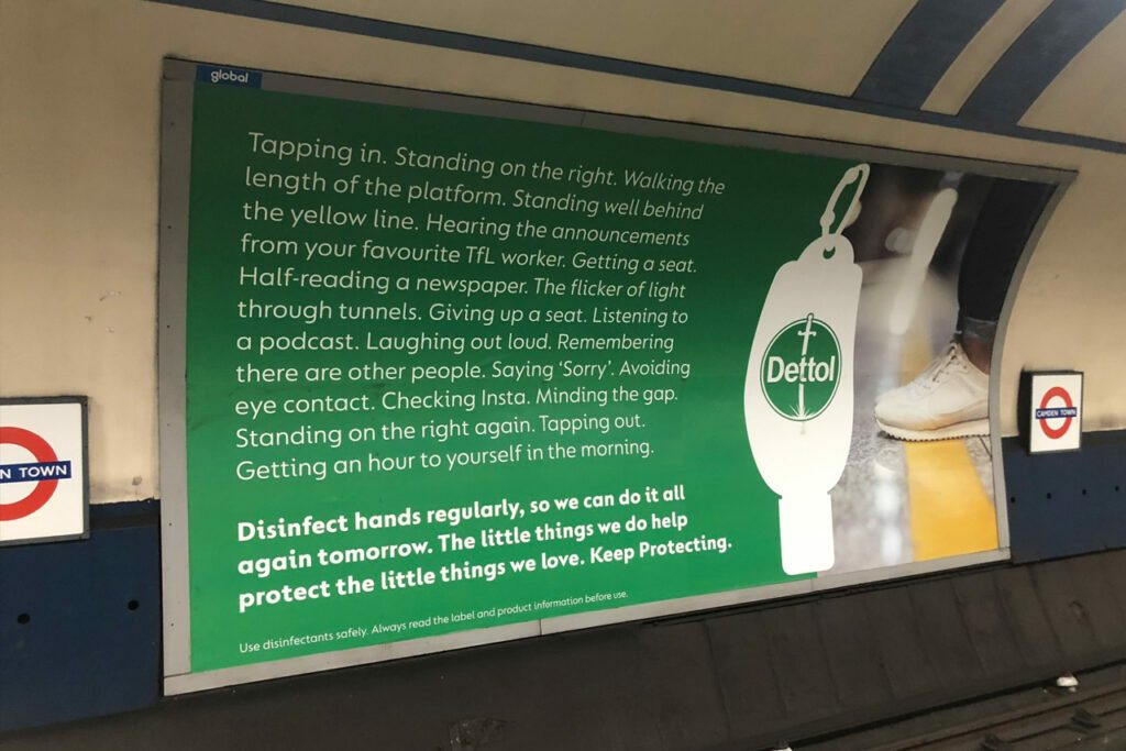
Think about the connotations of red, for example. Red is used widely to represent danger – on STOP signs, warning triangles, traffic lights. Yet it’s also synonymous with love or lust – think about the branding of Valentine’s Day or the connotations of red lipstick.  Our reaction to colour cannot be expressed in simple terms.

The feelings someone will infer from a colour are dependent on the object, its context and who is observing it.  When you’re designing your brand colours, this gives you a fantastic opportunity: you can make sure that the colours of your brand identity create the emotions you want from the customers you are focused on.  A 2006 study found that this idea of ‘perceived appropriateness’ is the crux of the relationship between colour and brand.

It’s all about your customers

In short, the answer to “what are the best colours for my brand?” from a colour psychology point of view is, “the ones that communicate the right message to your perfect audience.”

Knowing your customers – who they are, their demographics, what they think, why they choose to act in a particular way – will allow you to differentiate your brand design and identity to best appeal to your ideal customer. 

Research has found that predicting how your perfect customer will react to your chosen colours for your brand is far more important than the colour itself.

I don’t have a degree in colour psychology – where do I start?

If you’re looking to create a brand logo, makeover your brand design or make standards for your brand identity, here are the five steps to help you on that journey:

  1. Know your target audience.  Spend time getting to know your people.  You can do this through analytics from social feeds your business already has, using surveys amongst existing customers, or identifying your target market and using third party services to get polling data about how they behave as consumers.  Find out what motivates them and what their biggest concerns are.
  2. Know what differentiates your brand.  Get clear on who you really are as a company, what makes you tick, what your biggest values are, what you offer to the market that nobody else can.  These should be reflected in the brand identity and logo you eventually choose.  Want to be trusted and unshakeable?  That’s going to need a different colour approach than a company that wants to look fun and spontaneous.
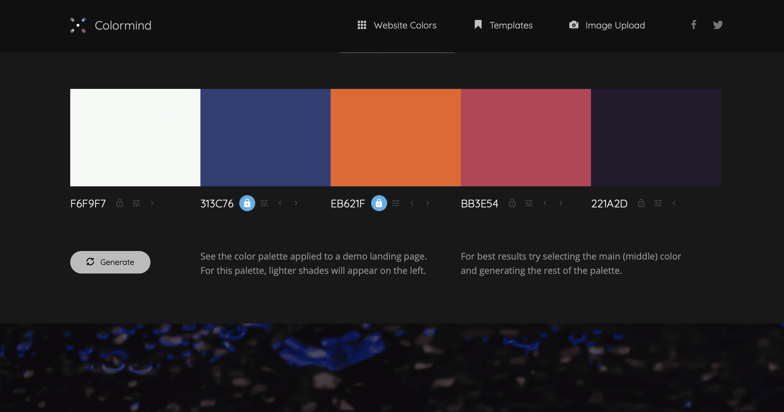
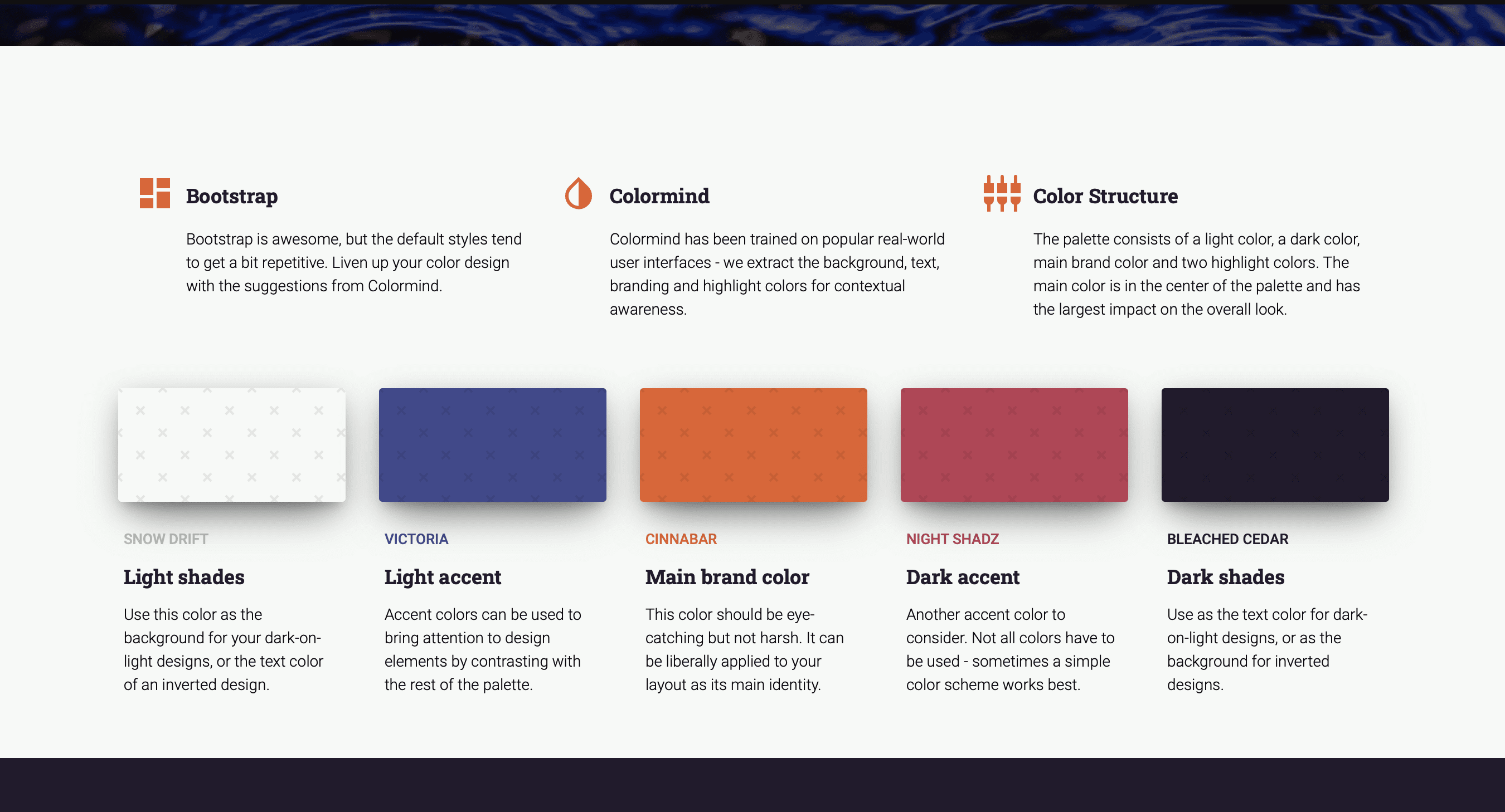
  3. Read around some resources on brand colour psychology.  We’d recommend these as good starting points.
    • Coschedule has a really detailed article about the emotions generated by different colours.
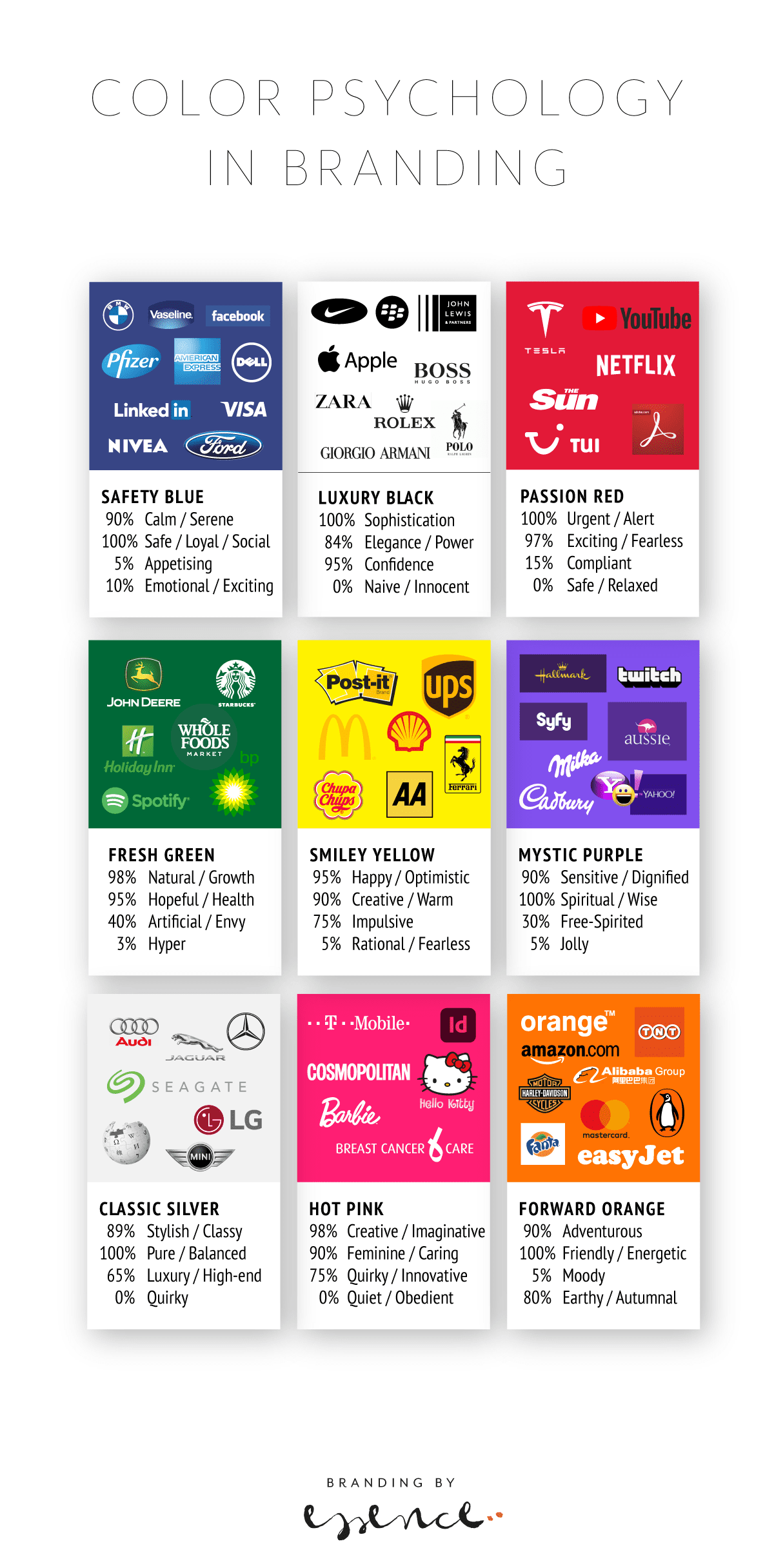
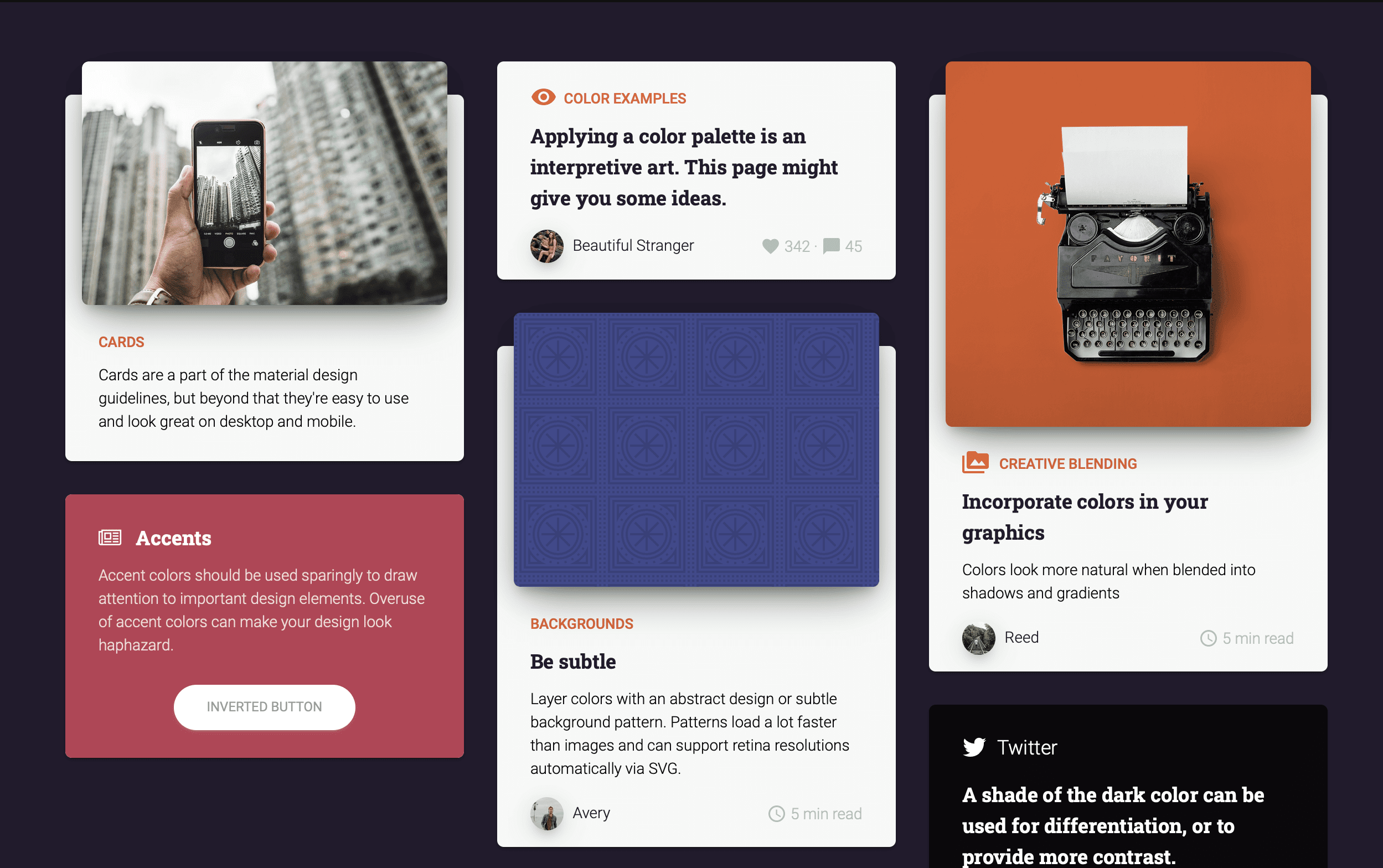
    • Essence has published an infographic showing brands and colour meanings.
    • Hubspot has a handy breakdown of colour emotions and gender
  4. Go back and check your ideas with your audience.  It’s best not to make assumptions.  You could run focus groups amongst your customers or target audience, alternate your top 2-3 brand colour schemes on your website during a promotion to see how each one performs, or offer a discount for feedback on your new brand identity.
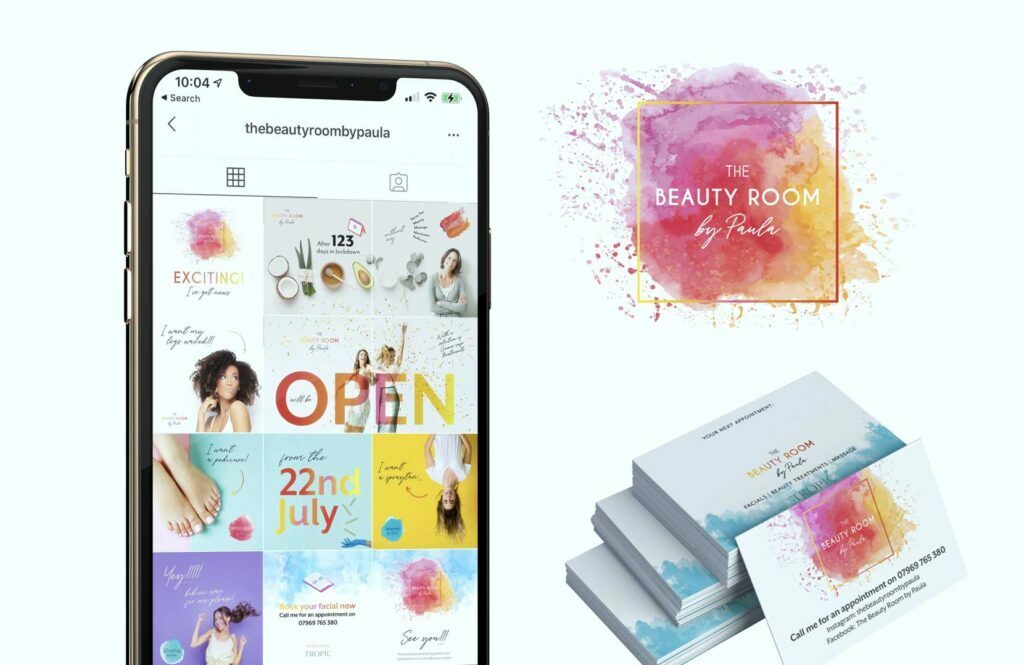
  5. Make your brand identity consistent across your business.  So often, businesses spend time and money creating a logo, or evaluating the colour scheme across their website, only for these standards to be lost in the depths of the shared folder. Set up brand guidelines including your colour palette in RGB and CMYK, how the colours should be used across your content (e.g. headers are always orange, call to action buttons are always turquoise) and with links to the approved logo files. Make sure new employees are trained in these resources and existing employees know how important brand identity is for business success.

Make sure your brand will always communicate the right message to your perfect audience.

If you’d like to talk more about your brand identity design, drop us a line.

brand personality, Colours, psychology

Graphic design brand materials

Brand colour swatches and why they matter

Have you ever wondered why so many companies of a certain type use a certain colour in their brand identity? And how it gives you a funny feeling when you see one that just doesn’t kinda fit?

Most of the popular brand colours make sense in one way or another – with blue being the expected ‘safe’ options often chosen by insurance companies, classic technology or financial businesses. Brands that live on trust and reliability.

Black is also suitably predictable. Luxury, confident, powerful – with the downside of sadness and grief. Purple seems to be the chosen colour for chocolate and tech…

Find silver logos and you will definitely find cars! And of course luxury brands with a traditional sense of wealth and exclusivity. Look at well-known green-coloured brands and you will see an eclectic mix from coffee through to oil. This may be because green does not only stand for healthy, wholesome goodness, but also for freshness, growth and innovation.

As with all things, colours and their brand allocation come with subtleties and subjective notions. How you feel about purple may be different to how your dad does – and which shade is chosen can also tip the balance from vibrant to icky or classic to dull. Colours are one of the most powerful tools we have when designing brand identities, yet they are also one of the trickiest one to get right.

It would be interesting to find out what the most common colours are and if that has changed as brands have changed throughout the ages.

Can you use colours to predict which brands will stay and which will disappear from the high street and which will be the new stars?

Read more about colour psychology and brand identity design in Emily’s article.

brand, brand advertising, brand design, Brand Identity, brand identity design, Brand Strategy, Branding

Tech, branding and ducks

I just mentioned a paragraph I have in our brand strategy workbook to my other half, techy Steve, and he taught me yet another new thing. Duck typing! (“Duck typing in computer programming is an application of the duck test—”If it walks like a duck and it quacks like a duck, then it must be a duck”—to determine if an object can be used for a particular purpose. With normal typing, suitability is determined by an object’s type.” Wikipedia)

Our brand strategy workbook talks about why you should bother with a brand strategy: “If it looks like a duck, swims like a duck, and quacks like a duck, then it probably is a duck.” With a good strategy, you make sure your duck isn’t suddenly featuring a shark fin and razor sharp teeth hunting little chicks…

I like it when tech and design share the same sentiments.

Brand Strategy, programming

Weird

How to add Adobe fonts to Spark

If you want to add Adobe fonts to your Adobe spark app to use in branded content and you think the obvious route is to go to ‘brand’ and add the font there, you may look in despair.

Of course you can add your own fonts, but that involves uploading the font files – which with Adobe fonts you can’t do.

It’s only after contacting support that I came across a workaround.

You can’t add the font to the brand templates themselves, but you can add them to text in the post itself.

ON DESKTOP
ON MOBILE
  1. Add a new post
  2. Go to add text and edit
  3. Find fonts
  4. Scroll down on desktop until you get to Adobe fonts and scroll to the right on mobile to the last panel with fonts.
  5. Activate them and assign them to the text.

Hope this help! And please let me know if you find any other workaround to this!

Tutorial

What is an aperture

Both in photography and in typography, the aperture describes an opening. In cameras, its size correlates with how much light goes in. In typography, it’s closely related to what’s called a counter.

As per Wikipedia, a counter is the area of a letter that is entirely or partially enclosed by a letter form or a symbol (the counter-space/the hole of).

Letters containing closed counters include A, B, D, O, P, Q, R, a, b, d, e, g, o, p, and q. Letters containing open counters include c, f, h, i, s etc.

The aperture then is the opening between an open counter and the outside of the letter.

There are also variations. Take lowercase ‘g’ for instance, which has two typographic variants. There is the single-story version which is much seen in sans serifs with one closed counter and one open counter (and hence one aperture). Then there is also a version more often seen in classic typefaces – the double-story which has two closed counters.

anatomy of type

Serif fonts classification

Serif Typefaces and their lesser-known sub classes

A serif is not a serif, so there are sub categories, pointing to the origin of each class. Serifs can be categorised as Venetian, Old Style (Geralde), Transitional, New Transitional, Modern, Slab Serif and Wedge Serif.

Serif type has its origin in a necessary artefact of stone masonry where Latin words were carved into stone in Roman antiquity. When you work with a chisel, there would inevitably be a starting mark, and the serifs would allow words to appear aligned. The Victorians used serifs in all of their typefaces, and they were common in Italian Renaissance architecture where they were seen as “Roman.”

Serifs remained a distinct feature of certain typefaces long after technology moved type away from stone.

Venetian Serifs

Venetian serifs are oldstyle typefaces named after the first roman typefaces used in Venice around 1470. Their key characteristic is the slanted crossbar on the lower-case ‘e’.

For example: Centaur, ITC Souvenir, Italia, ITC Berkeley Oldstyle

Old Style Serifs

Also called Geralde, oldstyle serif typefaces were designed during the 16th and 17th centuries, especially in France and Venice. Their e-bar is horizontal.

For example: Times New Roman, Plantin, Sabon, Bembo, Trump Medieval

Transitional Serifs

Serif typefaces created in the 18th century, and forming a transition between the Oldstyle Garalde and Modern Didone styles.The foot serif is usually level and stress is vertical.

For example: Baskerville, Caslon, Garamond (Stempel), Romulus

Modern Serifs

Modern or abrupt serifs first appeared in the late 18th century and are easily recognised by the extreme contrast between thick and thin lines. The serifs are usually straight and much finer.

For example: Bauer Bodoni, Walbaum (Linotype), Caledonia

Slab Serifs (Egyptian)

The slab serif (also called mechanistic, square serif, antique or Egyptian) typeface features thick, block-like serifs. The serif terminals could be either straight and angular (Rockwell), or rounded (American Typewriter).

For example: Rockwell, ITC American Typewriter, Clarendon

Wedge Serifs

The wedge serif, or hybrid serif, comes with little or no contrast and can feature either wedge-ended serifs, wedge-shaped serifs, half serifs or fine line terminals. They are often upper case only typefaces.

For example: Cooperplate, Albertus, Meridien, Romic

If you want to read more about type classifications off the beaten track, I can recommend the Typefinder that was written by Sarah Rookledge and Phil Baines (who used to be my tutor at Saint Martins College).

serif fonts

Find your way around online

Navigating Online

If anyone ever had any doubt, this year must have shown to businesses of all sizes and varieties that the world is happening online. And as a business, it’s ever more important to give customers a great brand experience when you can’t be there face to face.

There are lots of ways to have an online presence, and each business is unique in some way, so there isn’t a right or wrong formula – but looking at a combination of different media together with ‘traditional’ print, advertising and marketing will be a good starting point to devise the right strategy for your brand.

Below are some ‘brand touch points’ where people will interact with you to consider. Remember, it’s no longer a case of having a product, filling a niche and giving customers the choice of ‘take it or leave it’… Brands are made by the people that buy them. It’s vital to build loyalty, support and advocacy for what your brand stands for right from the start so your business resonates with the right audience.

“Your brand isn’t what you say it is. It’s what they say it is.”

Marty Neumeier
  • Website
    The headquarter of your online operations. All roads should lead back to it in some shape or form (and in your email footer) and landing there should be a pleasure that won’t disappoint. That’s one of the reasons why a website can’t just be something that looks like a template you populated in a day with stock images and dated graphic. It needs to sparkle and be as genuine as your brand should be.

    You may need a brochure or an e-commerce site, or a hybrid of both. You may need an app for mobile devices. Talk to your agency about the best option and beware of tying yourself to systems that can’t be widely supported.

    Invest not only in a progressive CMS (Content Management System) and design made for you specifically – think about using your own brand photography and don’t forget the website copy. If you spend all this time planning and organising a new site, you may as well go the extra mile to make it as future proof as possible.

    Think about using video on your site – explainer videos for instance are a great way to bring your story in front of your clients in an engaging manner. Sound could also be a good medium, but give people the option to browse on mute! Nothing worse than going to a website in your break and the whole open plan office knows which site you’re on…

    Make sure your site’s design and layout is responsive, so it looks good on a mobile or tablet and on a desktop or large screen. Different content will need to be considered for different devices, but that’s where your agency can help you with their expertise and advice on what works best where.

    Use new technology to make maintaining and updating your site easy and time efficient. Dynamic content, custom fields and advanced integrations can transform the way you use your web content as part of your marketing – and save you a ton of time.

    Don’t forget about speed, SEO and security. And GDPR! That subscribe form better be opt-in and your cookie policy should have the required choices available if your site is setting cookies. Have a look at your privacy policy if you collect any date and make sure your site has a good SSL certificate so users and browsers can trust their information is secure.

    Thankfully, there are lots of tools available online which allow for entry level functionality that can grow with your website as you grow your business. You don’t have to start with a high-tech rocket to reach the stars. It has to be capable, for sure, but with the right base you can add more features as you go along and learn more about what your customers need.
  • Social Media / Third Party Platforms
    There are so so many platforms out there now, one thing is clear – you can’t be on each one of them. So a good first step is to ask where your ideal customer hangs out. Using your ideal client as the central focus for how you run your online marketing is a neat little helper whenever you get stuck. What would they want? Where would they go? What would they expect? Would my content make sense to them? The answers will guide you to finding a manageable selection of platforms to create your profile on.

    Just like for anything that has your brand identity on it, make sure your social media profiles look the part. Consistency across all the different media will help to establish your presence in the market and give your customers confidence that they are in the right place.

    Look at getting a suite of templates for social media in place. Make a content plan. Think about what to post where when and to which audience.

    If you are using Zoom or similar video chat software to hold client meetings, think about your background. It may be worth to create a branded background that looks professional if you have to work from home without a home office.

With a good reputation
and the right audience, you don’t have to shout to be heard.

Regine Wilber
  • PR
    Having a presence in the news is a powerful tool for building your brand reputation. If you have a story to tell, tell it. There are not only literally millions of blogs and websites out there looking for fresh content, there are also reputable online events, magazines or news sites where your latest news could be featured. It takes time and patience and a bit of luck, but it’s all there for you to establish your brand online.
  • Emails and beyond
    There are some fantastic tools out there to help make your customer’s journey a smooth and happy one. From online chat bots to personalised, automated client email campaigns with Zapier or IFTTT integrations, the possibilities and opportunities are endless. Email is still one of the most important elements in customer communication, so make sure it’s top-notch.

    Think about spam prevention, which can be a real minefield. No point sending out fantastically crafted emails if they end up in spam. Try plain emails with interesting footers rather than mailchimp style HTML templates that may switch off the recipient because they instantly think they are being sold to. A/B test a campaign with different approaches.

    Make sure your list is clean; no point having unsubscribes and spam reports from people who haven’t really asked for being contacted. There are some great email providers out there for transactional emails which can tie in with your website and submission forms and provide a link to your CRM where you keep track of your contacts and lead pipeline.

    I also wanted to just touch upon measuring your activities. Google analytics, serpstat, rocket link and bit.ly, jetpack and all those tools within different platforms provide you with data about how your content performs. It’s a good idea to spend some time to assess which metrics are of real value to you, what matters at the end of the day and which you should mostly focus on to make a difference to your bottom line.

Hopefully this gives you a brief overview of the complexities of a digital marketing strategy. With any of these, consistency, continuity and good content is key to your success online.

If you’d like to chat about your website and everything around it, please get in touch!

online brand management, web development, website design

New brand identity for High-end Tour Operator Luxury Vacations UK

Luxury Vacations UK had outgrown its existing brand we developed for the client over a decade ago. The timing was planned to coincide with a major re-work of the tour operator’s website, as well as their promotional tour guides and the introduction of branded tour videos.

The new brand identity combines the UK’s iconic symbols of England, Scotland, Wales and Northern Ireland together with a classic, luxurious colour palette and visual details to be used in the material.

The re-brand focused on the company’s main audience, visitors from the US, who have cultural expectations and perceptions of the UK as a destination. The brand features a contemporary and non-cliché translation of the company’s values, deeply connected to their highest standards for customer service, luxury accommodation and the tours designed to allow overseas visitors experiencing ‘the real UK’. Delivering engaging, professional and expert tours with chauffeur guides has always been at the heart of the business and shows in the personal writing style of the copy, as well as the eclectic photography showcasing the tours’ highlights.

Using gold foil and a bespoke colour for each of the constituent countries means the brand identity is versatile to branch out into sub brands for regional promotional campaigns whilst remaining a recognisable badge for high quality luxury guided tours in the UK.

The brand has been rolled out across the new website, marketing materials and videos.

Colours, colours, colours

Fast becoming one of my favourite colour palette sites is http://colormind.io (Yes, they should have an ssl certificate, but I don’t think they will steal your date – you can just use it as a tool and don’t have to give away your personal info).

The site uses AI to generate however many additional colours you need for your palette. You can define some core ones you want to definitely keep and it will ai its way around those to match with other options. It’s a great way to test contrast and appeal on actual elements, see what it feels like without having to apply it to your web theme yet.

It’s perhaps meant to be an introduction for the products linked to it which allow you to create pages with Material Kit – but I am using it for the colours itself. Thank you Jack!

The-Woodlands-Suite-Website

The Woodlands Suite

The private wing of the Royal Orthopaedic Hospital in Birmingham needed a completely new website. The site is based on Joomla and uses our fully customisable page builder to create a new, clean and fresh site.

Data such as the team, news and specialties are managed with dynamic content, making it easy for the client to update without having to go into every appearance of information separately. Most frequently changed content is managed via the creation of a new article, which is the simples form of adding content.

If cats could talk...

Existential holiday reads

If cats could talk, would they cry… by Anatoli Scholz

I kept the book for my holiday so I could read it cover to cover. I mean – if cats could talk… I have so many thoughts about that! Forget about Garfield, we’ve got a house cat and I do wonder… 

The scene is set nicely to get you into the feline transformation universe.

I enjoyed the light hearted atmosphere the author creates whilst painting the picture of our main character’s background. I would have liked to explore a bit more what life as a cat is beyond the obvious challenges of food, communication and movement (although communication was unexpectedly uncomplicated).

The book moves through the various characters involved and you go with them until eventually you arrive at the place where it all comes to a finale with some catty surprises along the way.

It’s certainly been an entertaining and easy read and it did make me think (the end is interestingly ambiguous). As a fan of Felidae by Akif Pirinçci, I was perhaps hoping for a bit more intrigue and cat related observations, but the book is definitely worth a read, cat lover or not.

One detail I noticed which is totally ‘just me’ I suppose was the paper it’s printed on – it felt really coated and stiff, something I had to get used to. 

I’ll definitely recommend it and perhaps there’s a part two… 

the-world-is-closed

Brand management in a locked down new world

175 days into life with Corona, businesses are getting used to developing ways of dealing with the volatility and uncertainty the pandemic keeps throwing at us. 

Surveying smaller companies we work with, there is a shift in brand management emerging. Initially, it was key to keep customers informed of restrictions and closures. Since lockdown has been lifted for businesses, this has changed to communicating safety measures and new procedures. 

In the early days of the crisis, we worked with our clients to prepare for internal and external communications. The Royal Orthopaedic Hospital implemented new strategies straight away, realising the need for up to date information. We helped them to utilise their existing system to adapt for internal comms.

Another client of ours, a dental practice, supported people with ‘home dental kits’ and online advice on how to keep their teeth healthy without being able to see a dentist. Since they were allowed to open again, they worked overtime to get through the mass of emergency appointments and help those most in need. By working flexible hours and reacting to the immediate needs of their patients, they secured a lot of new clients who couldn’t get appointments for months in other surgeries. It pays to be flexible.

Most of the companies feel that they need to maintain and improve the ‘goodwill trust and understanding’ they have received from customers, especially on a local level. Brick and mortar shops more than ever rely on their community. 

Rebrand and social media template designs

A beautician we’ve rebranded during lockdown had started doing online beauty tutorials, promoting selected products available to purchase online When it came to opening again, we created a social media puzzle grid to announce the news and inform customers of Corona related changes.

Another business, a tech skills company, changed all their focus to delivering courses online. There is a barrier of confidence to break through, but it’s also a great opportunity to reach a much larger audience.

The smallest local entrepreneurs and micro businesses have been hit enormously and are still struggling to make up for lost time. For them, communicating on social media has been the lifeline to keeping customers engaged without being able to take bookings.

Within all that, the overwhelming trend seems to be for brands to work their best to keep their promises. Everyone is tired and probably a little bit bored of this situation and it’s a delicate balance of pushing on within the limits and being able to fulfil expectations. The bigger brands have the advantage of networks, funds and processes. 

For the little ones, however, flexibility in changing service delivery, product ranges and in some cases their entire business model offers a real opportunity. 

Image from Twitter/@mmtowns

Nobody wants the patronising attitude of big brands jumping on the government messaging bandwagon. (Remember Dettol and their ‘back to work ad’ which recently got a lot of mocking?) Nobody wants to constantly be reminded of the crisis, either – another balance to strike in brand communications.

SMEs with their feet firmly in the community feel their efforts are best focused on excellent service delivery and customer communication without pretending all is rosy. With more and more businesses disappearing from the high street, there is a gap and a good chance for those with an open mind to create mid Covid brand loyalty. 


Cover photo by Photo by Edwin Hooper on Unsplash

SVG files and Joomla – a workaround

SVGs are super exciting especially if you are working with platforms that allow animating strokes and controlling the svg file with css. It’s also really convenient to have super sharp logos in a very small file size on your site. Speed is so important…

But with the security settings of Joomla, it’s not straight forward to get an svg file onto your site. If you think you can bypass the issue by going into global configuration for media and adding the extension to the list of allowed file types. You can do it, but you will promptly be ignored by the system.

So here is a workaround on using svgs on Joomla. (Obviously only use your own files where you know you’ve not added extra code that may compromise your site. )

Step 1

Create a folder in media to store all your files in. The standard folder is /images so somewhere in there is efficient.

Step 2

Access the files via FTP or a file manager. You can use something like FileZilla or go onto your host site and go through the file manager. Upload your svg files onto the server.

Step 3

Now it depends whether you are using a platform that supports SVG or you have to input the path directly into the media area if you are in joomla directly.

joomla, svg, web development

akeeba

A little trick when you hit a locked installer in Akeeba

If you ever need to restore a backup with Akeeba Kickstart, follow their documentation video from their website and before you click ‘run the installer’, read this:

If you have ever tried to run the installer and it says “The installer is locked”, there is something else you need to do first. After extracting the backup archive with Kickstart and before you click on the “Run the Installer” button connect to your site with FTP or SFTP. Delete the file installation/password.php. Now the installer will be unlocked.

You can use a programme such as Filezilla to ftp onto the site. Then, look in the installation folder for the password.php file.

On this sample, it was in controllers in installation / angie – I’ve renamed the file to June-password.php just in case I had to have it again but that worked.

unlock

Screen caps magic

Whether you are trying to put together a presentation or you want to share a bit of news in an email – or you are trying to present some creative work to a client – screen caps are super useful to capture and explain – well – screens…

On a Mac you used to have this wonderful shortcut of command, control + shift and 4 (which is a bit of a hand full, but well worth the finger acrobatics) and you can start dragging across an area of the screen to take a snap which gets copied into your clip board. So from there you can easily add it to your powerpoint or publishing software without having to go through import processes. Unless you design for print, the quality should be fine.

If you have a Mac with a touchpad, you get a neat little interface asking you if you want to drag across the screen yourself or you want to capture a specific window or just the entire screen. Then you can also specify if your destination is the clipboard, documents, desktop or preview.

If you want to always save your screen caps in a specific location, or if you want to specify a custom location, you can do that, too.

First, click Command + Shift + 5 and your screen will go faded out with a little menu at the bottom. I’ve made a little screen recording of the function to demonstrate.

Once you’ve set this up, you can use the short cut to access that menu. You can go even further than this by checking the absolute short cuts in system preferences.

Shortcuts in system preferences

It seems to follow the rule of save to file with command, shift and a number plus option if it’s for the clip board. Definitely one to work with.

screen cap, shortcuts

A shortcut to building bridges

When you are in photoshop and want to just quickly open bridge to look at a bunch of pictures you may want to use, it’s a little shortcut that comes in handy: Command + Shift + O. It’s a bit weird cause it looks like nothing happens but then it pops up.

Why would you use bridge?

Bridge is a digital asset manager, or a media manager, which kind of sums it up. It also implies that it’s not just for photos, but for any creative assets, videos or sounds etc. You can view, sort, rate and assess your media in a number of views. The name Bridge gives it away as well – it’s not just a companion for photoshop, it works for InDesign and Illustrator and other Adobe tools, too. Like a bridge over hopefully not troubled water…

Here is a link to Adobe Bridge if you want to have a snoop around.

bridge, shortcuts

Kate photography branding

The marvellous Mrs Hollingsworth

This has been one of my favourite projects recently. Creatives are like doctors – the worst patients. I am not sure if I read this somewhere or if it’s an unspoken gospel. For me, I know how hard I find it to promote myself. Not because I don’t believe in it, but because clients always come first and as you all know, it takes a lot of time to get everything look ‘on brand’. So when Kate asked me to help her rebranding again now that she’s been in the photography field for nearly 10 years, I jumped at the task.

It has been a journey, that’s for sure. A windy road of trial and error because Kate cares just as much as all good creatives do about their work and how it’s seen by others. So it was a brave move for her to step out of her comfort zone, show who she truly is and what her passion is in a non-photographic visual sense. We’ve had many sessions going over her brand values again and again to see if they held up in light of her approach, ideal customer, specialism, tone of voice, etc – and how this should be reflected in the brand visuals.

She’s a pro, always has been, as a TV director and then as a photographer, and she’s one of a kind. Which is why this identity is bold and bright and as quirky as Kate is. The print material is designed to emphasise her style and the lovely story telling of her images.

We then created a matching website for her portfolio and blog. It’s designed for mobile and desktop and showcases her wedding, brand and family photography.

It’s been a pleasure working with Kate Hollingsworth and I hope she gets all the recognition she deserves (which is tons and tons and tons!!!) Go Kate, get them married!!!

brand design, Brand Strategy, Design, website design

How to add free apple fonts

Apple has released more free fonts as part of Catalina. You can see the complete list of fonts to download here:

https://support.apple.com/en-us/HT210192

When you get to your FontBook app and click on ‘All Fonts’, you will notice that some of them are greyed out. It’s really easy to unlock them though, all you need to do is to right-click on a greyed out name and then on ‘download font’ and et voila, you have the selected font or font family installed.

Quick Screen Recording of the process

You can either select the fonts one by one or pick a bundle.

Here are some of the available fonts:

There are also new display fonts:

I’ve tried out one of fonts, Produkt, in a little opener.

Prudukt Font
I’ve created this font feature box with Unsplash

Apple, Catalina, free fonts

repsonsive-website design

Mukwashi Trust School

Design for charity

It’s not always about the money. And when a client of mine mentioned his new charity project, helping a school in Zambia, it felt right to be involved. With branding and design work being in short supply during this lockdown, this was the perfect time to put my energy into a project that will hopefully help change people’s lives.

The website is now live – mobile friendly and responsive so locals can have easy and quick access to the school’s information.

And I’ve designed a flyer with the school’s highlights, ready for locals to read and consider. The leaflets were given out these past few days. Tim shared some messages from the school with me…

“Leaflets have been collected. Everyone delighted. They start distributing them tomorrow. (…) Leaflet distribution today. I hope this makes it feel real. Right now, 7400 miles away, your leaflets are being read by candlelight and paraffin lights in mud huts and shacks.”

Tim Pain

We are also printing some stickers for their school bus and there will be a road sign for the school. It is amazingly rewarding and humbling at the same time.

To see the community so involved with the school, how the kids are understanding the opportunities that will come for them because they can get an education and to have teachers able to work in improved conditions makes me realise not just how lucky we are but also that we shouldn’t take anything for granted.

charity, education, marketing

Fooled by Progress Book Design

Fooled by Progress

Complex problems require simple solutions. This book, by acclaimed British journalist Ross Butler, explains why.

This book is a survival guide for humanity. It explores the concept that progress is not about complexity, but based on simplicity. That in fact, simple solutions are far better suited to complex problems – whether in your own life or in society at large. Understanding the reasons for this is the first step to making your life, and the world, better.

This isn’t a self-help book.

https://youtu.be/haOSmlwdJXo
Perfect read for anyone interesting in progress – and simplicity

You can get your copy on Amazon.

Work-from-home

Corona Crisis help for directors of Limited Companies

Martin Lewis has looked at how limited companies may be able to get help from the government.

Key points:

If you are having PAYE, you can go on the furlough scheme.

You CAN’T work any more, however:
You CAN continue to do your statutory duties, such as filing tax returns.
You CAN’T generate revenue. (With that there are issues about what it means, so the rules and guidance are not clear and Martin Lewis is giving some examples.

You could, for instance, prepare marketing material for your company that may in future generate sales, that may be acceptable, although he can’t guarantee it as there is no clear guidance on this.

You could also work in your profession, whilst on furlough, for a different Ltd company.

Worth the watch, thank you Mr. Lewis for spending your time and using your connections to finding things out.

You can also apply for universal credit whether you are on the furlough scheme or not. You need to check if you are eligible, and there are things such as savings being taken into consideration. However, you can at least apply if you are struggling, worst case you can’t claim.

Hope this helps…

Clapping for our carers

Clap for our carers

Annemarie Plas shared the idea for an event that united the nation. 8pm was the time to make some noise for our carers – 2m apart of course – to show how thankful we are for all they are doing right now. She says “If the Dutch can do it, the Brits can do it, too!”

We set up our own street WhatsApp group at the beginning of the crisis and I shared the link to the appeal an hour before – replies of ‘our hands are ready’ and ‘we will be there’ came in and at 8pm we were lucky to experience a wonderful event. Neighbours stepped outside the house, clapping away, cheering up and down the road, all with gratitude and spirit.

Thank you, NHS.

We will be back again next week to make more noise!

What-do-brands-do

What brands do in a crisis

Another day in isolation, another day where brands are being made or broken by how they react, how they communicate and how they connect to us during this outbreak. 

I get really annoyed now by all those automated funnel sales emails that are coming through fishing for subscribers. The jolly sales talk of marketeers trying to tell me how to make my money with PPC and FaceBook advertising, or how they can set up retargeting pixels for me to work wonders. Put it on pause! My whole world is… 

It’s house hold brands as well though that show their true nature, good and bad.

Wetherspoons informed workers that they will no longer be paid, saying he would only start payments again once the Government’s scheme to cover 80% of wages is in place – despite the Treasury saying that grants for salaries could be backdated to March 1.

Sports Direct is highly criticised for their handling of staff safety amidst their belief that the shops should stay open despite all the dangers this poses to staff and shoppers. 

Apple, on the other hand, has been able to source 10M masks for the US and millions more for the hardest hit regions in Europe. In his tweet, Tim Cook shares the news. 

BrewDog, an independent distillery in Aberdeenshire, UK, has used its distillery to produce hand sanitiser and is giving it away to local charities and the community. James Watt, Founder of BrewDog, said on Twitter: “We want to do all we can to help everyone get through this difficult time.”

German manufacturers Rotkäppchen and Jägermeister are helping out by supplying ethanol for the production of desinfectant.

For those of us home schooling, various TV personalities are offering their time for free to keep kids active and help to educate them. Carol Vorderman has opened up her online maths school for free for the duration of the school closures: https://www.themathsfactor.com/

Joe Wickes is doing daily PE class workouts at 9am on his Youtube channel: https://www.youtube.com/watch?v=K6r99N3kXME

David Walliams releases a free audio story on his website every day for 30 days and there are lots of free activities/resource packs to download: https://www.worldofdavidwalliams.com/elevenses/

Darcey Bussell is giving free dance classes on her DDMIX FaceBook page. Audible has made hundreds of stories free during the lockdown. https://stories.audible.com/start-listen

Supermarkets are doing their best to make shopping easier for the elderly by having special shopping hours amidst panic buying and empty shelves.

There is so much going on, good and bad, and these just a few samples of how this crisis is not just a test for the operations side of companies, but also for their brands. We are vulnerable, we are uncertain and we lean on those we can rely on – be it in our neighbourhood via WhatsApp groups, via social media or phone calls. We don’t just seek the comfort (albeit mostly remotely) of our families and friends, it’s brands we look to for reassurance just as much as we look at our politicians and celebrities.

It’s judgement time and brands – personal or business – have the amazing opportunity to use their profiles to help people not just with products but mentally.

Of course there is one brand that should get a knighthood if there was such a thing. The NHS is doing amazing things. It really is a people brand. I am humbled by the hard work they do, the impossible situation they find themselves in and the ongoing commitment they show to our health. It’s absolutely awe inspiring. There are countless examples of their efforts to campaign for #StayAtHome…

I have been lucky to work with quite a few NHS hospitals / operations on branding and web projects, so it’s pretty emotional for me personally at the moment because I know the people that work there are struggling right now and there is not much I can do. I’ve volunteered to help along with 400,000 other citizens hoping that I can give a little bit back myself but I am afraid it will only be a small drop on a hot stone.

The NHS – for me – is definitely one of the brands that seems to be genuine and authentic from the inside out. Something every business should aspire to be from a human point of view.

I hope we will get through this together and have a chance to say a big THANK YOU to all those brands that are on our side right now.

attitude, brand loyalty, brand management, Brand Managment, brand message

How to stay sane working from home

If you are usually working in an office, motivated by your team and the structure put in place by your managers, working from home can be quite a daunting experience.

It can be easy to feel that you are not getting anything done and a sense of stress/panic may set it, so:

Productivity:

  • Wear work clothes. Pretend you are going to the office in your normal attire.
  • Track your time – either on paper or with the many good apps. Break it down by section of work or client.
  • Make a checklist at the start of every day, preferably on paper.
  • Add to the list little incidental tasks you didn’t first think of, even if quite minor.
  • Tick off everything you’ve done during the day.

In terms of sanity:

  • Take the time to have tea breaks.
  • Take them away from the “office” preferably in the garden.
  • Don’t listen to the news all day. Find some good music or, if you can concentrate with the spoken word, find some good podcasts or audio books.

Fitness:

  • Don’t snack.
  • Stand up regularly and stretch.
  • Take calls whilst walking if you don’t have to be right in front of your computer.
  • Plan some exercise at lunch time or in the evening.

Communication:

Make the effort to keep in touch with your colleagues.

  • Have a morning catch up.
  • During the day, ask them how they are and what’s their setup like.
  • Don’t get mad if they appear not to be working as much as you, it’s not a race to the bottom, and their circumstances might be different to yours.

Family:

  • Make a conscious effort to be forgiving, the kitchen might be messy, the kids might start to get crazy. It’s new for all of us, and as an adult we have to be a sponge for some of the stress.
  • Try to get some one to one time with each family member, either for a game or chat or cooking together.

End of day:

  • Look at your list to see what you’ve achieved and be happy about any of the ticks, no matter how minor!
  • Think of something or someone that you should be thankful to. Even if small.
  • Try to get the whole family to do the same.

Mostly remember that this will end. Also that we are incredibly lucky.

Message us if you need any help.

attitude, business, corona crisis

Working from home – with your significant other

We are living in crazy times right now, that’s for sure. No matter what your working circumstances are, it’s going to be a wild ride before anything gets to be the new normal.

One thing I don’t have to think or worry about is what it will be like working with my husband.

We started Essence together in 2003 and both gave up our day jobs in 2004 / 05 to dedicate all our time to our consultancy. Since then, we have been working side by side on-off project depending, and our relationship has not suffered, but there are some things we found worked for us…

We work in a little home office, in one room. That may not suit every couple, but for us it is nice to be together (unless Steve has a string of video conferences to attend) and it’s practical to keep work in a work space. If you want or have to share a room, consider this:

Agree first on what background noise you will have during working hours

This is super easy now with lots of types of noise cancelling headphones, but before that we used to chat about what’s on our plate and if we needed quiet time or if some music would be good. Steve is a developer and analyst so when he has to focus, classical music really works for him. I am a soppy person and it makes me feel very emotional so it’s not that great for me when I’m designing. I prefer to listen to programmes so it’s a bit like having office banter in the background. And when I do strategy or copy writing, it’s all noises off – apart from the cat purring…

Don’t chat about non-work stuff at work

Time is precious. Especially now when we also have kids to entertain, uninterrupted work time is a premium. Don’t get distracted by catching up on what DIY needs to be done or what holiday plans you may want to make. Instead, wait for natural gaps in between jobs, meet in the kitchen for a cuppa and chat then. You get a little break and don’t feel you’re interrupting. If you need a break before your partner, have it, but don’t impose it on him or her and pull them inevitably out of a good train of thoughts.

Instead, use the ‘commute time’ to sit together and have a banter – the saved travel time is perfect to use for chit chat!

Wear work clothes

Don’t sit down in your undies or pjs. We found it helps to pretend to be in a real office even if it’s just a corner in your home. (Plus it may be too tempting to pursue more leisurely activities if you sit there semi clad 😂).

Share boring admin

If you have rather dull but necessary admin tasks as part of your work, same business or not, do them at the same time so you can agree it’s ok to moan about them! We do… and it helps to not struggle on your own.

Keep your work space tidy

If you can work from a study or spare room or even convert a corner in your bedroom to have a table in to work on, keep it tidy so both of you don’t have to feel pressure of more clutter to deal with.

Be patient and kind

Of course this is not going to be easy. You may find you function better in different rooms if you can.

If your jobs require different levels of concentration, noise cancelling headphones may be the answer without having to miss each other’s company.

No matter what the day throws at you work wise, don’t reflect your frustration on your partner. Being stressed is one thing, but venting on your other half who is an innocent bystander is not fair on them or you. If you get a bit wound up, talk about it (next break) and you might get a soothing shoulder rub and a hug! Be kind and accept it’s not going to be perfect, but neither is normal office work.

Respect different time requirements (but don’t use it as an excuse to hide during tea prep)

Very much job depended, it may well be that one of you can finish early. That’s ok… we all need to do the best we can and on another day it could very well be you needing to ‘stay late’.

Saying that, if it’s always you then ending up doing the household whilst he is working longer, beyond the usual hours, it’s good to check if perhaps the project itself is at fault and timings need to be adjusted. It’s easy to fall in that trap and the one left to hold the baby may resent you for it.

For us, it’s always been pretty seasonal that I have to work more at certain times in the year but I have a break first when the kids are back from school to have time with them and do household tasks together. I then add a late session if I need to.

I’ll let you know how I get on having my three boys all day every day now and working around home schooling them. I figure that’s a completely different challenge to being productive with your partner working beside you 😂😂😂

attitude, business, corona crisis

How to lock down documents

Amidst the current corona crisis, one of my clients needed a quick fix to communicate some potentially scary documents with their staff without alerting the public, and they didn’t have an intranet.

We had a brainstorm to look at the existing website capabilities without the need to setup a separate login area and to minimise admin, and DocMan from Joomlatools had the required features.

One option was to stop search engines from indexing the documents on the website. You can see here how to stop indexing.

The perhaps better option however was to also lockdown the documents completely to a user group that would only internally be granted access. So we set up a new access level with viewing permissions specifically for this type of documents. You can see how to lock down documents in DocMan here.

That way, no second system is required, and a shared internal login makes the access relatively easy.

Ultimately, a user based registration process that can enable and disable staff access is obviously the preferred solution but as a quick fix that worked for them.

coronacrisis, workarounds

Admin? The stick of creative work.

I filled in a business health check and one of the questions was how you cope with admin.

It’s the dread of most businesses – it has to be done, someone has to do it, and sadly, being a creative doesn’t mean you can get away with ignoring those excel spreadsheets, accounts packages, quotation and estimation work, and keeping track of those expenses, invoices, subscription renewals and travel receipts.

You can run, but you can’t hide and your next quarterly VAT might well turn into a nightmare orchestrated by Mr. Admin. I’ve been there, believe me, and it’s honestly far more ugly and stressful to pull a late nighter trawling through email histories and getting accounts in order than managing it a little bit at a time.

I’ve developed my own little rule of thumb… (love that expression). I can’t start creative work until the admin is done. That’s on 4 out of 5 working days. On the 5th day, it’s the other way around. It’s creative first, and potentially no admin at all (unless there’s print buying to be done as part of a creative brief).

This may sound petty and not suit everyone, but I need a clear head to think outside the box and worrying about that email I need to reply to will just hang over me and stop me from thinking freely.

And doing a little bit every morning first means there isn’t much to catch up with.

It also allows me to happily go into what my colleague Steve calls monk mode. In monk mode you just focus, ignore everything else, email, chat, news of another calamity, and you buckle down to concentrate on what you’re working on, nothing else.

I love being in monk mode. It takes the guilt out of not reacting to every inbound query in whichever form whilst I’m dedicated to what I’m working on and usually results in a much faster output than trying to do too many tasks at once. There has been a time when we all functioned without instant responses, and it’s ok to wait a couple of hours for a reply…

I’m obviously bound to urgent deadline requirements and sometimes it all goes out the window and I need to do an after hours catch up, but generally, by changing my attitude towards those more technical tasks and seeing them as the stick that gets me my yummy creative carrot, we’ve become quite good friends (Mr Admin and me).

What is a masterpage in PowerPoint?

It’s also called a slide master in Microsoft PowerPoint, and it’s basically the slide that sits above all the other slides and as such it controls the visual elements of the theme, such as the layout, background, colours, fonts, and also where these are positioned on any slides you create within that theme.

That way, you can create a consistent look and feel for your presentation.

Beware, there are limitations to how clever the slide master is compared to other publishing software with the same concept of master pages (such as InDesign). In PowerPoint you can’t position elements on the slide master to be on a certain layer (above or below) in relation to elements on the actual slides. But those little niggles are more for your graphic designer to fight with 😂 and hopefully your template will be set up so you can easily work with it to create a consistent look for your brand material.

You can read more about slide masters here at the Microsoft Support site.

Screen cap from Microsoft office support.

master pages, master slide, PowerPoint

ED Awards Email

Always say never! Oh, never mind…

This morning, something dropped in my mail box and I had to look twice, three times even and check my previous emails to see if it really could be true. Did Gmail and Unibox have a serious issue with their font translation? Or is the font of choice for the European Design Awards entry newsletter really Comic Sans – in capitals?!?!!?

In a mild state of shock and disbelief (obviously there are more pressing issues out there than what font an awards organisation chooses to pop in their email header design), but I had to check it out with WhatTheFont and it really seemed to be Comic Sans… Hmmmm.

And then it hit me. Never say never! You can laugh now at just how dumb a moment I’ve had this morning. Their little visual hook was just perfect to get me, obviously gullible and opinionated when it comes to branding and design, to keep reading… so well done, mission accomplished!

My only criticism, I guess, is the fact that the newsletter and their social media look so different from their actual web home page. I think that’s what threw me. It was only when I saw their Instagram that the penny dropped and I could see the method in the madness.

So, after all this, and hanging my head in shame for doubting their taste or typographic sanity, I can only thank them for highlighting once again how critical good typography is for design, no matter which media.

With the amazing tools available today for web, email and obviously print, typography is sadly still very much an afterthought for SME brands with a ‘that will do’ attitude when looking at their marketing and brand collateral.